This is the best list of presentation tips on the Web. Period.
In fact, you’ll find 69 nifty strategies and techniques (all illustrated with real-world examples) to prepare, design and deliver irresistible presentations.
Plus, 100% of the tips listed below only take a few minutes each to implement.
So you’ve literally got no excuse 🤓
Let’s dive right in…

Presentation Tips: The Complete List
This guide is broken down into 5 core sections. You can either start from the beginning (recommended), or click on a part that matches with your goals:
🔭 Part 1. How to craft a message that resonates with your audience [4:48]
⚙ Part 2. How to prepare and structure a solid presentation [4:12]
📝 Part 3. Presentation content tips to write effectively [8:00]
🗂 Part 4. How to design beautiful, engaging slides [11:32]
📢 Part 5. How to dramatically improve your public speaking skills [7:50]
🔥 Part 6. An infographic packed with all the essentials (+ Bonus keyboard shortcuts) [4:30]
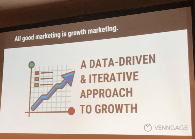
CHAPTER 1:
How to Craft a Message That Resonates With Your Audience
 In this section, I’ll help you get the basics down.
So whether you’re a business professional, a startup founder or a high school student, you’ll learn my favorite tips for preparing a presentation that’s laser-focused on your audience.
👉 Practical strategies to uncover who your audience is and what they want
👉 Formulas for crafting the perfect message for your presentation
👉 And much more…
Take an Audience-Centered Approach Right Off the Bat
Research shows that people who understand their audience are more successful in achieving their communication goals.
To know more about them, answer these questions:
What are their demographics (age, gender, location, income…)?
What are their psychographics (beliefs, interests, values, culture)?
What are their hopes, fears and dreams?
How will your presentation help them get more of what they want?
Here are some practical online resources you can use to learn more about your audience:
Use These Two Audience Analysis Factors to Uncover Their Expectations
First…
Assess their knowledge of the topic
The content of a good presentation has to match with the expectations of your audience. So your goal is to find out what they already know (or don’t) about the topic you’re about to cover.
Now, there are 3 major types of audiences.
Your goal is to identify which category yours falls into:
| The “lay” audience | No special or expert knowledge. They usually need background information. |
| The “managerial” audience | Any background information, facts, or statistics needed to make a decision should be highlighted. |
| The “expert” audience | The most demanding audience in terms of knowledge, presentation, and graphics or visuals. |
Then…
Understand their attitude toward the topic
Knowing your audience members’ attitudes about a topic will help you tailor the content of your presentation in alignement with their expectations.
To uncover what they think, answer these questions:
How interested are they about the topic I am about to cover?
Have they heard of my company / product /service / solution before?
Where is their knowledge gap (what can I teach them that they don’t know already)?
Do they have all of the information to make a decision?
What fears / anxieties could be holding them back?
Pinpoint Your Presentation “Type”
According to the California State University Employee Development Center, we usually of give presentations to either inform, persuade or educate.
Inform -> “ABC Marketing Department: Q4 Sales Projections”
Persuade -> “Super SEO Agency: How We Help You x3 Your Conversions”
Educate -> “10 Advanced Presentation Design Techniques From The Pros”
Identify in which category your presentation falls into.
Define The Goal of Your Presentation
Setting goals has been proven to increase both motivation and success rate.
And because studies have also shown that “individuals with clear, written goals are significantly more likely to succeed than those without clearly defined goals“, here’s what you are going to do:
Take a big piece of paper and write down one crystal clear goal for your presentation. That’ll help you stay focused and remove anything that does not help towards that goal (more on that later in the post). Be as specific as possible:
I’m doing this presentation to [ goal ]
For instance:
I’m doing this presentation to….
Teach advanced growth hacking techniques to startup founders
Get my boss to agree with the social media strategy my team has put together
Build a relationship with that prospect (so two months from now he wants to purchase from us)
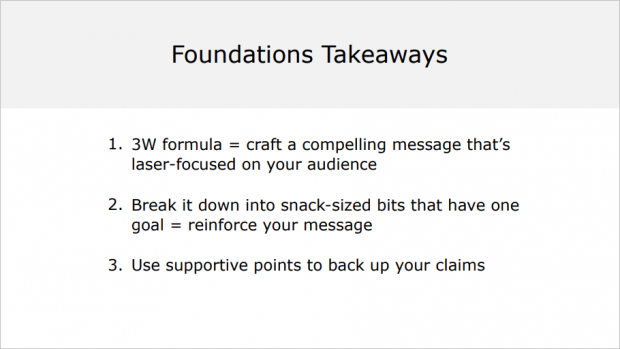
Craft Your Core Message
Your core message is the #1 thing you want your audience to remember.
So here’s the deal:
It’s very important because every piece of information you’ll be putting inside your slide deck will be angled toward supporting that one thing.
Now, use this simple formula to build it:
Action verb + who + what
Action verb + [ targeted audience ] + [ result wanted ]
For instance:
Show these NYC-based consultants how my company can help them get more leads.
Convince my boss to increase the marketing budget next year.
Break Down Your Core Message Into Small Chunks
What are the top 3-5 big reasons that will motivate your audience members to do what you want?
The point here is to think about what you need to tell them to reach your presentation goal.
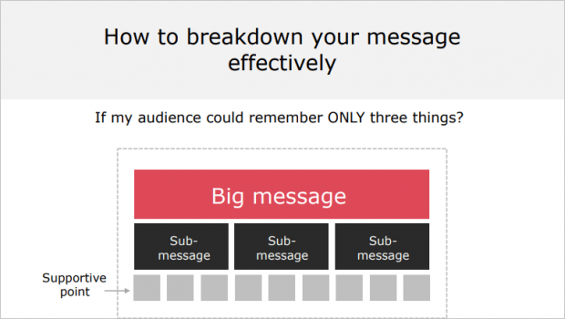
Do this exercise:
If my audience could remember ONLY three big things about my presentation, what would it be?
(1) __________
(2) __________
(3) __________
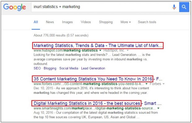
Backup Everything With Data
Every claim needs to be backed up with supportive points confirming it.
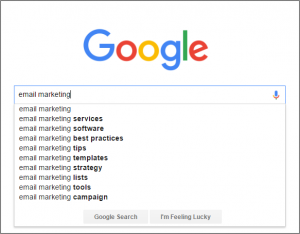
To find reliable resources (statistics, research papers or case studies), head over to Google and try these search strings:
site:edu + “your keyword” + “data”
site:URLof a site you want info from + “your keyword” + “report”
inurl:research + “your keyword” + “statistics”
quotes about + “your keyword”
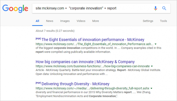
Here’s an example where I’m looking for a McKinsey report related to corporate innovation:
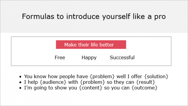
Wrap It Up Into a Solid Elevator Pitch
Elevator pitch = summary of the purpose of your presentation in one sentence
Most people can’t do it (try asking your colleagues next time they’re working on a slide deck at the office…). But the thing is, making an elevator pitch is a great way to feel confident about your presentation and help your audience understand what it’s all about quickly and precisely.
To do that, make sure your elevator pitch answers this question:
Why should I listen to you?
Today, I am going to teach you about [ result ]
Today, you will get / discover / learn / access [ outcome ]
If you agree to meet with us, you will [ result ]
For instance:
Today, you will discover how ABC marketing can help you increase your leads acquisition.
Today, I am going to teach you the 3-step process I used to double my organic traffic in 2 months.
CHAPTER 2:
Presentation Preparation & Structure Strategies
Now that you know exactly who your audience (and what they want), have a clear goal and message for your presentation, it’s time to move on to the next chapter:

Structuring your presentation.
👉 My 5-step process for building presentations from scratch (and how to use it for maximum efficiency)
👉 Simple frameworks you can use to structure crystal-clear presentations (if you’re in sales, you’ll love the persuasive story pattern…)
👉 Three types of slides that’ll help you improve the clarity (and effectiveness) of your presentations
And more…
Use This 5-Step Presentation Process
First, list the different steps you usually follow to make a presentation (or check out mine below).
Then, write down the estimated time you think you’ll need for each step.
That will help you keep track of the amount of time spent on each of them and be more efficient. Here’s the 5-step process I personally use:
1) Define my presentation’s goal
2) Craft my message (the # 1 thing I want them to remember)
3) Develop the outline and structure (the 3-5 things I must say to get my message across)
4) Gather all the pieces of info needed to back my message up, write the copy
5) Consolidate all elements and design the deck
Leverage the OBC Formula to Craft a Solid Structure
Here’s how most presentations are structured:
- Opening: Tell them what you are going to tell them. This section highlights what your presentation is all about.
- Body: Tell them. This section distills your message, sub-messages and supportive points.
- Closing: Tell them what you told them. Wrap up the key insights of your presentation, and include a specific call-to-action if that’s relevant.
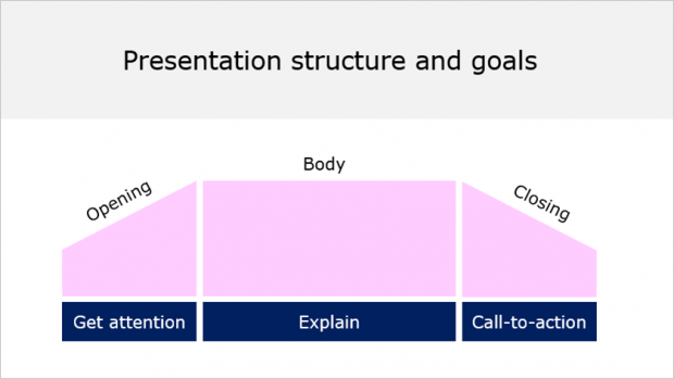
Now, let’s imagine you’re making a sales deck pitching a SaaS project management product. Here’s how your structure could look like:
- Opening: the problem behind getting all teams on the same page today
- Body: 3-5 arguments supporting how your company’s product can solve this problem
- Closing: agree to send the prospect a proposal by next week
Use the “So What” Hack to Cut the Fluff
When structuring the content of your presentation you want to do one thing:
Put yourself in the shoes of the audience and ask “so what?” (AKA is this relevant and crucial to support my message… or not).

For instance:
Uh, lemme state that XYZ company was funded in August 1998 by Bob Smith who was…
Duh, “so what”? Nobody cares. Get rid of it.
Apply the “One Slide = One Idea” Principle
One slide = one idea / message / point.
The content of each slide must be tied to your core and sub-messages, otherwise don’t bother.
The purpose of this slide is to [ ____ ]
For example:
The purpose of this slide is to [ show that our sales grew by 16% this year ]
The purpose of this slide is to [ demonstrate that our app features are the best in the market ]
Use the Persuasive Story Pattern
The persuasive story pattern is a storytelling technique that will help you structure a presentation that’s easy to digest and remember.
And because it’s based on a problem/solution approach, this technique works especially well for pitch decks and sales presentations.
So here’s how it works:
First, start with describing the life as your audience knows it (the status quo). Highlight their core problems, pain points, or a situation they’re currently facing that requires change.
Then, lay down the dream (what is could be). You’re basically revealing the path to a better way here.
Finally, develop on the points that will help escape from the conflicting status quo situation you previously introduced.
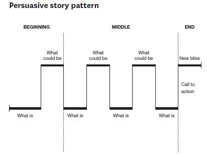
Here is an example:
Problem: current situation faced by your audience. Do you suffer from/Sick of being…
Dream: how it can change. It doesn’t have to be that way/there’s a solution…
Solution: your solution. Imagine if you could…how your life would be if you could…
Use the Three-Act Narrative Structure
The three-act structure is an old storytelling principle that can be found in plays, poetry and movies.
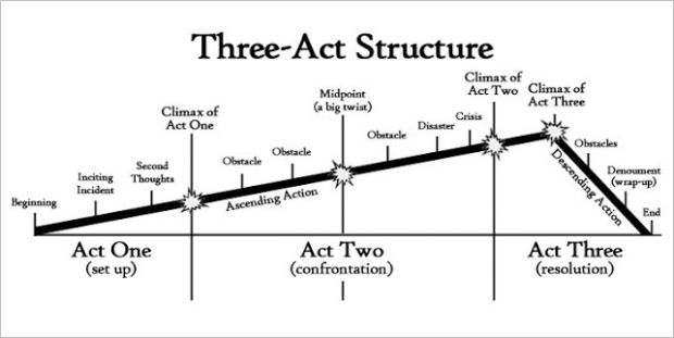
Set up: climate change / tiny farmers providing food to restaurants
Confrontation: how climate change affects the growing season
Resolution: policies that should be in place + how people in other areas are mitigating the effects of climate change on local resources
Add Transition Slides
Embedding transition slides works especially well for long-form presentations:
Investor decks, business plans, webinars, annual reports, and so on…
Transition slides allow you to clearly separate the different sections of your deck, while helping your audience identify where they are in your presentation.
Here’s an example:
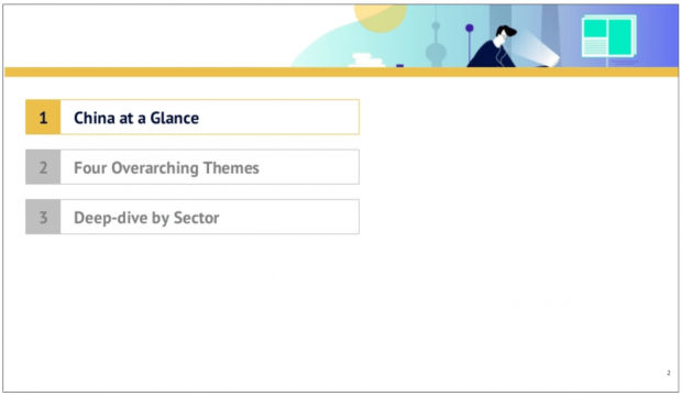
China Internet Report 2018 by Edith Yeung
This transition slide has three benefits:
- The audience knows they’re just about to start the first section (“China at Glance”)
- The audience knows Edith’s presentation has 3 sections
- People won’t be surprised by the next slide, as it will follow naturally
Add Summary Slides
Once again, this is really effective for long-form presentations.
Especially when presenting to senior executives, as they will often “want to go deeper into certain points that will aid in their decision making. If they do, quickly pull up the slides that speak to those points”.
Here’s an example of a summary slide:
Add Closing “CTA” Slides
Close your presentation with a clear Call-To-Action (which is what you want your audience to do when the presentation is over).
Here are three examples of CTAs:
- Q&A (if you’re presenting a webinar or teaching a class to students for example)
- Contact Us Today at 000-000-0000 (if you’re sending a sales deck to prospects by email for instance)
- Click Here to Learn More About [Topic/Product] (if you’re driving traffic to your website to capture leads)
Let’s take a look at an example:
Growth Tribe, a digital training company, ends up their slide deck with a very specific CTA (via Source). Plus, because they’re using UTM tags, it makes it super easy to track traffic coming to their landing page and, by extension, measure the effectiveness of their CTA.
CHAPTER 3:
Presentation Content Tips | How to Write Attention-Grabbing Copy
 In this chapter, you will learn essential copywriting principles so you can use your words to get information into someone’s brain (so they want to do what you want them to do).
You will learn simple tips and techniques to write in a natural, engaging way, and get your presentation message across more effectively. Here are some of the things we will cover:
👉 Smart strategies like the “brain dump” technique or the “Amazon hack” to come up with powerful headline ideas for your slides
👉 Timeless principles to guarantee that what you write is clear and to-the-point
👉 And more!
Integrate Headlines in Your Body Slides
Here’s a fact:
Adding a “succinct sentence headline identifying the main assertion (in your slide) leads to statistically significant increases in audience retention” (source).
Headlines are catchy phrases that are designed to summarize the main point of your slide. For instance:
Effective headlines share three core attributes:
- Short. A headline must be short to be easily remembered (rule of thumb: it should fit into the 140 characters of a tweet).
- To the point. A headline has to be specific (ideally, use numbers)
- Benefit the audience. Your audience shall see, whenever possible, an advantage based on the headline. Make. Their. Life. Easier. Tell them what your main point is (answer this question: “What do you want people to get from this slide?”)
Let’s take a look at a concrete example.
Here’s how Front, a shared inbox SaaS platform, introduces their team (to emphasize on how special it is 😍) in their latest pitch deck:
Use the “Brain Dump” to Write Powerful Slide Headlines
The point of the “Brain Dump” technique is to write down a couple of subject lines and start filling them in. For instance, your slide is about the weight-loss problem.
Let’s start writing:
Subject 1: How to lose weight (super sucky)
Subject 2: How to lose weight effectively (meh)
Subject 3: 5 best-ever weight-loss secrets from thin people (good)
Subject 4: 3 things experts won’t tell you about weight-loss (catchy)
Select the most attention-grabbing headline when you’re done. The one that make you feel like:
“Uhhh I want to learn more about that”
Or
“This headline condenses exactly what I’m going to cover next”
In case of doubt, get feedback from friends or colleagues.
Apply the “Amazon Hack” to Come Up With Headline Ideas
Let’s say I want to figure out some good headlines for presentation design services I have.
Throw in the term “presentations” into Amazon and see what comes up:
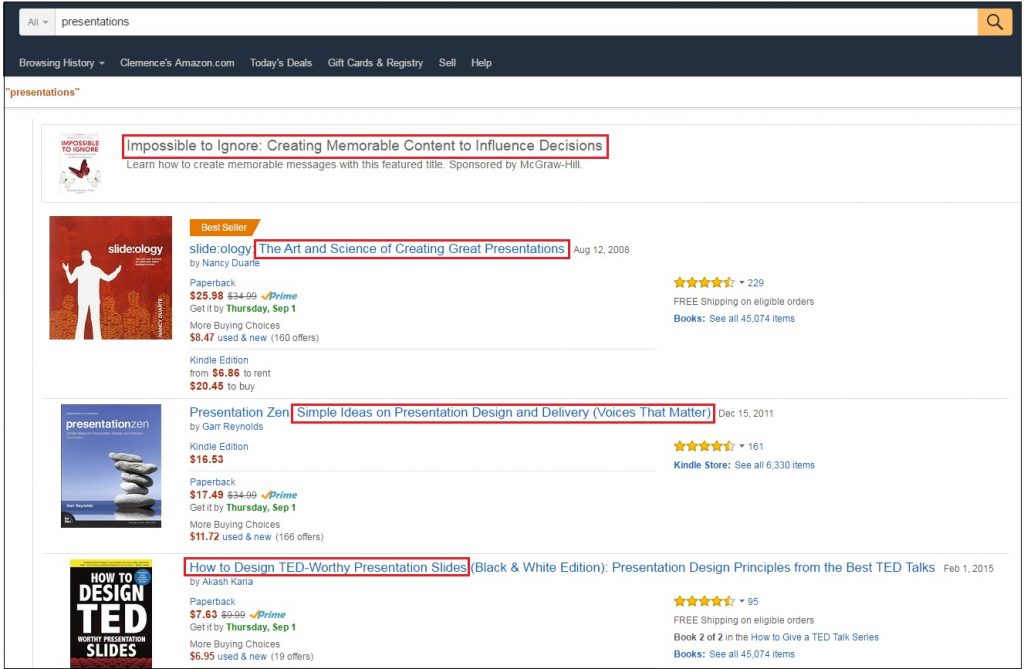
Example of headlines I can come up with:
The little-known secrets behind TED-worthy presentations.
I’ll help you design unforgettable presentations that influence, persuade and leave a memorable impression.
Use One of These 7 Proven Headline Starters
Use these starters:
New
Now
Here’s
Announcing
Presenting
Introducing
Look !
Source: CA$HVERTISING
For example:
Our powerful new seminar teaches sales reps the power of persuasion to drive people into a buying frenzy
Now you can stop worrying about your website traffic for good
Announcing the hottest new lobster roll of Paris
Use “Lenses” to Write Headlines That Convey Emotions
The concept of lenses helps you to write headlines that appeal to a specific audience. Lenses work especially well for sales presentations. There are three types of “lenses” you can instantly apply to your headlines:
- “Competitive” lens: “Dominate the search results, and leave Page 2 of Google for your competitors”.
- “Benefit Driven” lens: “80% faster than any other internet provider”.
- “Inspirational” lens: “What if you could learn the exact system to rank a website that generates traffic, sales & Customers 24/7?”
Use “Power Words” to Persuade
Which one sounds more appealing to you:
“A program to increase your sales”.
“A step-by-step, take-you-by-the-hand 4-weeks program that helps you double your sales in 60 days”.
That’s what I thought too.
Here, the power words are “step-by-step” and “take-you-by-the-hand”. Their target is to make the reader feel safe and confident.
If you want to your audience to feel something, start with defining which emotions you want them to feel (anger, curiosity, relief, happiness?). Then use proven power words that are tied to these emotions and integrate them in your presentation content.
If you’re looking to dig deeper on the topic, head over to that article where I detail the whole process.
Use the Below 50% Score to Avoid the Me-Too Syndrome
“Nobody cares about you, people care about what you can do for them.”
Here’s how the me-to syndrome looks like in real life:
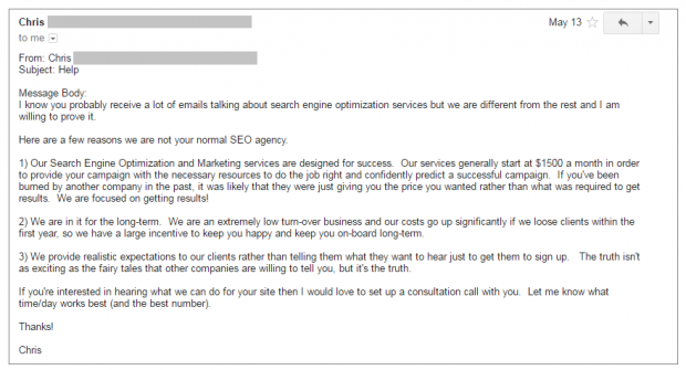
Can you spot what’s wrong with this spam email?
Well, I’ll tell you:
The me-too syndrome AKA the number of time it’s about THEM vs. the number of time it’s about ME.
Here’s the breakdown:
- THEM (AKA “I”; “us”, “our”): 15
- ME (AKA “you”): 11
- Me-too score: 58% (15/26)
To avoid the me-too syndrome, especially in sales presentations, make sure me-too score is under 50%, but more importantly… don’t talk about you, talk about what you can do for THEM.
How will you improve their business?
What will you tell them to educate them on a specific topic they’re interested in?
How will your skills/services/products will make their life better?
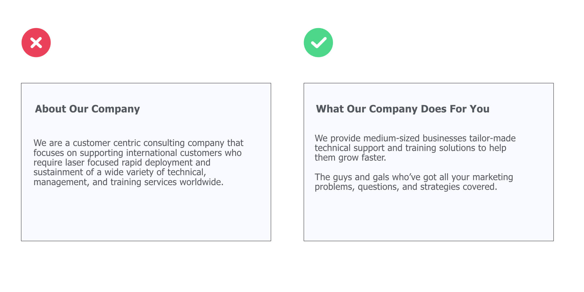
Use Simple Words Everybody Can Understand
Unless you’re making a super technical presentation geared toward a technical audience, use simple words people can understand.
See it this way:
People shouldn’t scratch their heads to try to figure out what you were trying to say. They shouldn’t have to think about it. It should be crystal clear.
Now, take a look at the different between a text that’s hard to understand, and one that’s fairly easy:
Use Numbers to Be Ultra-Specific
Always. Be. Specific.
Don’t say:
“How to improve your finance quickly and claim back your freedom”.
Say:
“How to cut your expenses by 26% in the next 30 days”.
Embed Examples to Be More Compelling
Which do you think is more persuasive, examples or statistics?
Read the following two paragraphs and decide:
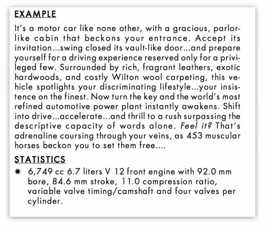
Wondering why the example whets your appetite for more instead of the statistics? It’s because emotions are the key to sales. If you’re making a sales presentation, make sure you always place your money on the example.
Apply the “Write to a Friend” Principle
“Write for the ear, not the eye. Old adage.”
There’s nothing worse than getting junk content from another me-too company that rambles on and on about how amazing they are.
On the other hand, when you read something that’s written to you – like personally – you’ll devour every word. Because you’ll want to know what’s in it for YOU.
One Sentence = One Idea

Don’t do this.
Instead, express only one though in a sentence.
Use your next sentence to say the next thing.
Make Short Paragraphs
79% of people scan read, rather than read every single word. Source
For instance:
I confess.
It’s a problem.
This is important.
Use the “Grandma Test” to Assess The Clarity of your Copy
Anyone should be able to understand what the slide is going to be about. Including your grandma.
Here’s an example:

How Linkedin Built a Community of Half a Billion by Aatif Awan
Ok, maybe your grandma doesn’t know what Linkedin is 🤓.
But she will understand that the presentation is about something that grew exponentially. The point here is that your cover slide’s content shall wrap up what your presentation is going to be about in an obvious (and concise) way.
Read out loud every single sentence in your deck and ask yourself:
Could my grandma understand this or not?
If the answer is no, then shorten the phrase or break it down in smaller, easily understandable pieces.
CHAPTER 4:
Presentation Design Tips & Techniques to Craft Gorgeous Slides
 In this chapter, you will learn practical (and creative) presentation design tips to finally craft gorgeous, engaging slides that get your point across.
Here are some of the things you are about to learn:
👉 Essential principles to start off the right foot (you’ll learn CRAP and “grid” systems so you never make these dumb design mistakes again…)
👉 How to design your slides for maximum clarity (Plus, I’ll share some cool data visualization tips so you can finally present charts in a sexy way!)
👉 Creative presentation design tips (like how to use shapes, text effects or emojis to craft beautiful slides, fast)
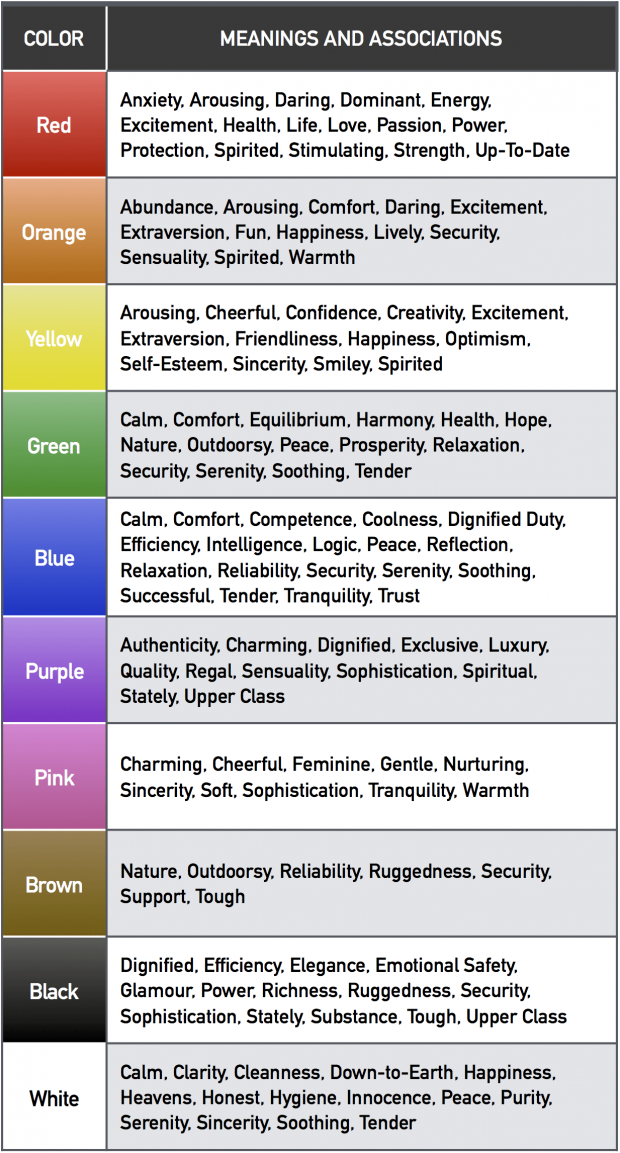
Use This Table to Create a Consistent Color Theme
Unless you already have an official set of colors, you need to create your own consistent theme and stick to it.
Your selected colors should be:
- Associated with your company (color increases brand recognition by up to 80%. Source)
- Aligned with your audience’s characteristics (76% of women prefer cool colors compared to 56% of men).
- Limited to two or three colors. I recommend to use dark grey/black for your text, and then up to two additional, contrasting colors.
Below, you’ll find a research-backed table that presents all color meaning sand associations.
Use it to find colors that work for you:
Here are several additional online resources to help you craft your winning color themes:
👉 Kuler. Create your own color schemes or just browse thousands of existing combinations ❤
👉 StylifyMe. An awesome tool that allows you to check the style guide of any website, including colors and fonts ❤
👉 The basics of color theory (fun, interactive article)
Integrate One of These Most Readable Fonts
Fonts can basically be separated between two major families: serif and sans serif.
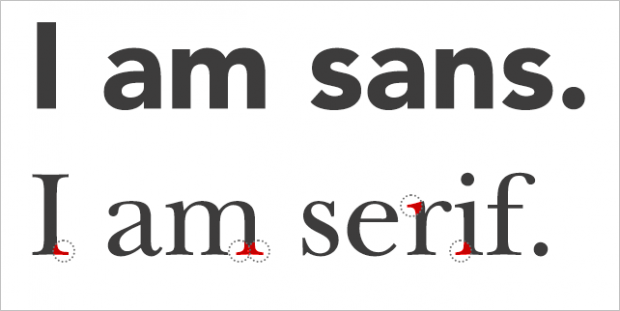
Here’s a simple, crash-course on font psychology that’ll help you pick the right ones for your slides:
- “Serif Fonts Are More Readable Via Print
- Sans-Serif Fonts Are More Readable Via Screens
- Serif Fonts Convey Elegance and Rationale
- Sans-Serif Fonts Convey Informality and Innovation”
Now…
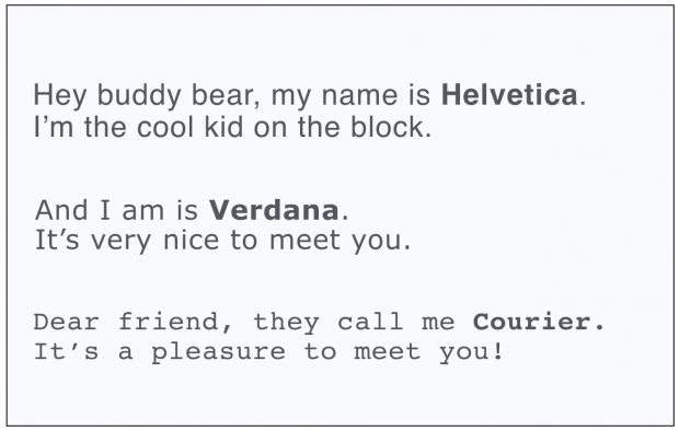
What specific font should you actually use?
The Software Usability Research Laboratory has demonstrated that the most legible fonts are Arial, Courier, and Verdana.
Research also shows that the following fonts are good for people with dyslexia: Helvetica, Courier, Arial, Verdana.
People are more likely to engage in a given behavior the less effort it requires (Source). That means your text size should be big enough to be legible to the person seating the farthest from your location.
To validate your font size: put your presentation file into the “slide sorter” (on PowerPoint) or “Light table” (Keynote) view. Then, look at the slides at approx. 66% (PowerPoint) and 160% (Keynote) size. If you can still read them, so can your audience.
Now, here is a great font resource:
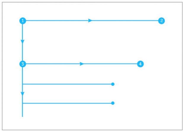
Structure Solid Slides With the “Grid System”
In her guide on creating great presentations, Nancy Duarte explains the principle of grid systems to design slides like a designer:
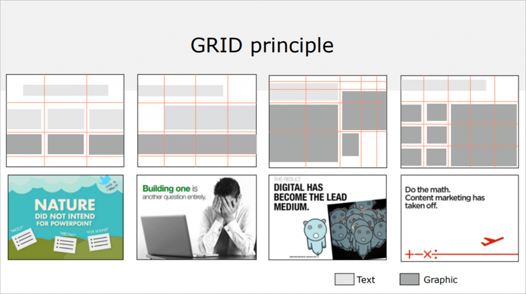
Here’s an example:
Apply the “CRAP Principle” For Better Slide Design
There are not a hundred but one principle of design that I want you to get under your belt.
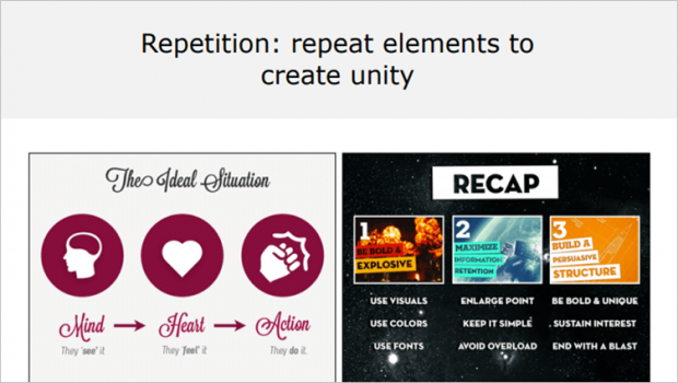
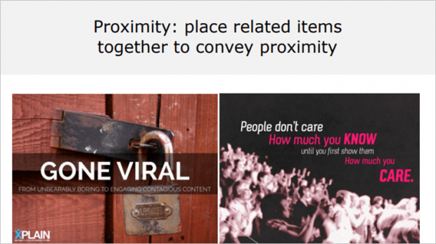
The CRAP principle: Contrast, Repetition, Alignment, Proximity.
Contrast is all about making things stand out. It can be achieved using three major tactics: manipulation of space (near / far, empty / filled), color choices (dark vs. light / cool vs. warm) and text (typography style / bold vs. narrow).

The AI Rush by Jean-Baptiste Dumont.
Repetition, for instance making a headline and a sub-message the same color, makes scanning your deck much easier. Repetition helps you create a cohesive look to your presentation.
Alignment. Newspapers use this to great effect. Aligning a whole bunch of elements with one another makes them scan faster. Alignment makes things easier to read.

Proximity means that things are associated with one another. Let me explain that for you: the closer things are, the more they are associated The farther they are away from one another, the less they are associated.
Optimize Your Slides With Alignment
Let’s quickly dive into the *A* of the CRAP principle…
First, make sure you’re using enough space between the different elements in your presentation slides.
Next, fix your slides to make sure the alignment isn’t off. For example, take a look at the difference between the left and the right slide below.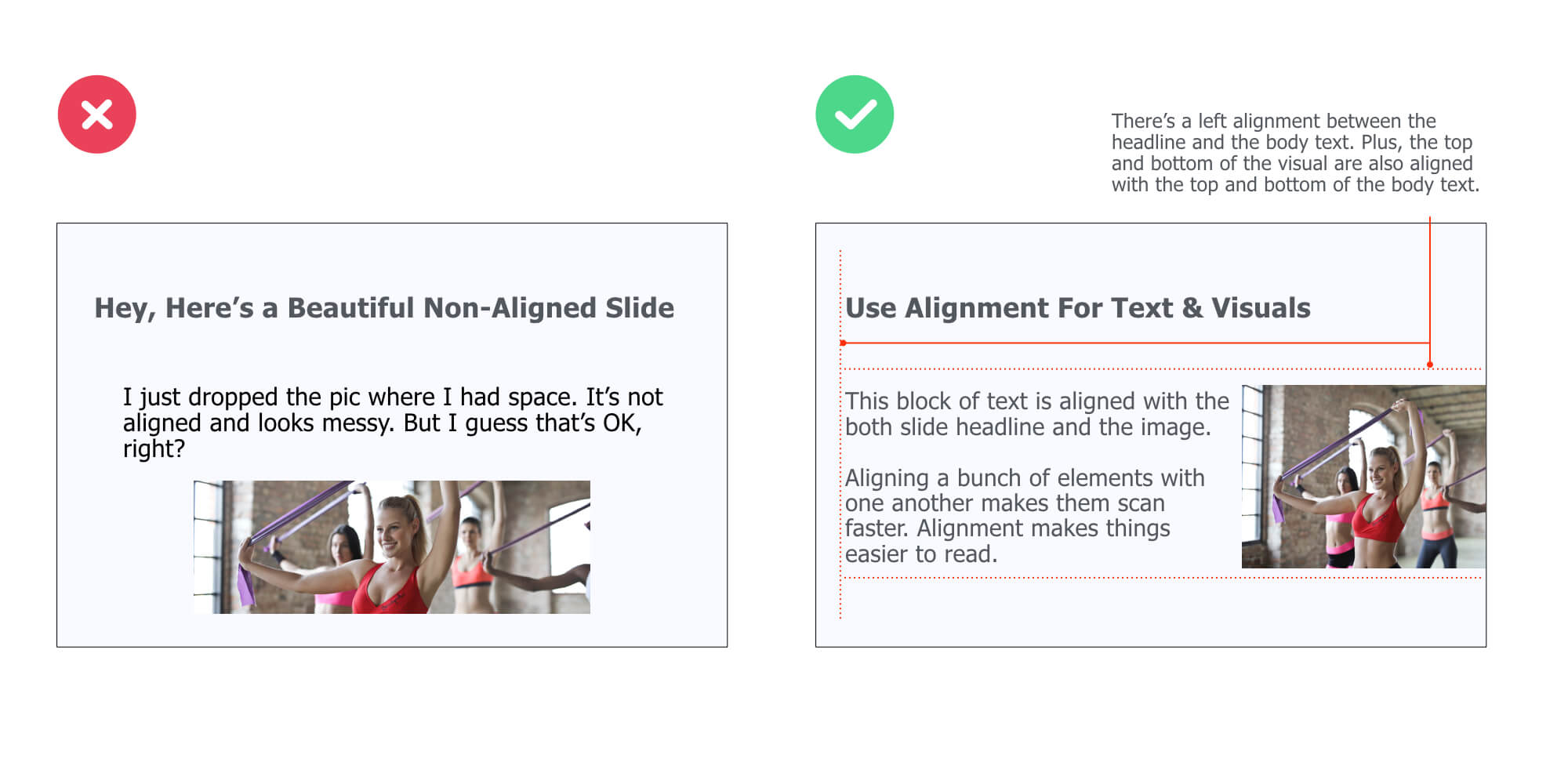 While there’s no alignment on the left side slide, the right slide is clearly structured with different levels of alignment: between the headline and the body text, between the top of the body text and the top of the visual, and between the bottom of the body text and the bottom of the visual.
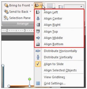
To align elements on your slide, just select the ones you want to align, and then do this with Keynote:
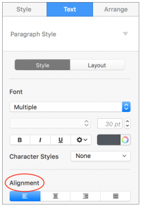
And this with PowerPoint:
Use Color & Weight to Create Hierarchy
You probably already know that modifying the font size is a great way to control the hierarchy within your slides.
But what you may not know is that changing color or font weight is another smart way to separate the important text from secondary one. Here, take a look at the example below:
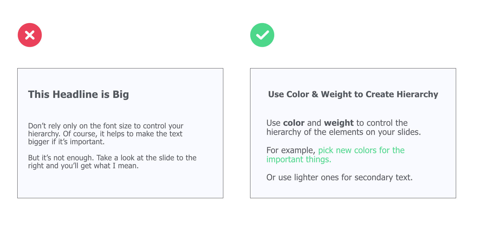 Now, here is a simple rule you can use:
First, chose a dark color for the primary content (such as the headline and body text of a slide).
Then, pick a contrasting color or/and bold font for important keywords you want to bring to your audience attention.
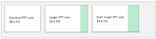
Customize The Size of Your Slides
Standard slides are usually sized 10 inches (width) * 7.5 inches (height). Re-size yours 12*7.5 (for PowerPoint) or Widescreen 16.9 (for Keynote).
The idea here is to have more horizontal space, meaning more freedom to design your slides:
Here’s how to do it:
- For PowerPoint, open a PPT document, go to Design > Page Setup
- For Keynote, go to Document (top right corner) > Slide Size > Custom Slide Size
Use This 3-Step Process to Design Slick Cover Slides Fast
Here’s how to design beautiful cover slides fast:
👉 Use a plain color for your slide background
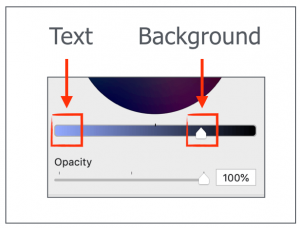
👉 Add your text on top of it. Use the Contrast principle to pick the color for your text (e.g. dark color background =light color text).
👉 Use different font sizes to create contrast and hierarchy between the elements. For instance, the title of your presentation should be bigger than the name of your company department (because it’s logically more important).
Here’s an example:
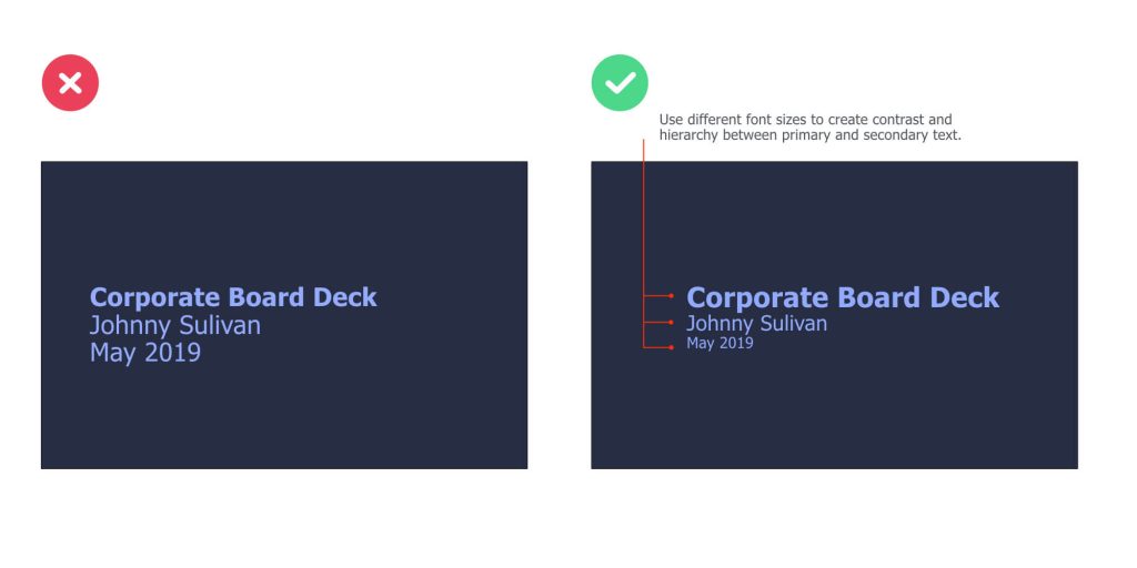
On the left slide, there’s a great contrast between the background and text. However, the different elements of text are of the same size, making it difficult to scan it.
On the right slide, we’re using different font sizes to create a clear contrast between important and secondary information. The color of the text is based on the color we chose for the slide background:
Alternatively, you could use a visual representing the point you’re trying to make (instead of a plain background). Here’s an example:
Bottom line: Anyone looking at your cover slide should have a clear idea of what the presentation is about to cover.
Here’s a great illustration where Tugi Guenes from Le Wagon, a coding bootcamp, is about to introduce a slide deck teaching essential user experience & design principles:

Apply the HSB Formula to Enhance the Clarity of Your Slides
For corporate decks and most business-world presentations, the content slides will very likely be broken down in 3 core parts: Headlines, sub-headline, body text.
(Hence the HSB Formula)
Now, let’s see what each part actually include (and take a look at a specific example after that)…
Headline
Headlines are concise sentences used to summarize the content of a slide. Good headlines have three attributes:
- Short. A headline must be short to be easily remembered (it should fit into the 140 characters of a Tweet).
- To the point. A headline has to be specific (e.g. use numbers)
- Benefit the audience. Grab people’s attention and help them understand what’s the #1 message of the side.
Subheadline
They are secondary headlines that basically elaborate on the main headline above it. They ‘re optional (don’t include if you don’t need them) and should be used to reel the reader in.
Body text
Body text provides the meaty details. It is usually coupled with visuals and graphs to provide supporting materials and help you get your point across.
As you can see, the HSB formula is quite simple to remember.
Now, let’s take a look at an example:
Headline: Sales Breakdown by Region (Q4)
Subheadline: China accounts for 52% of total sales over the period, representing an increase of 35% YoY
Content: Sales chart details and explanation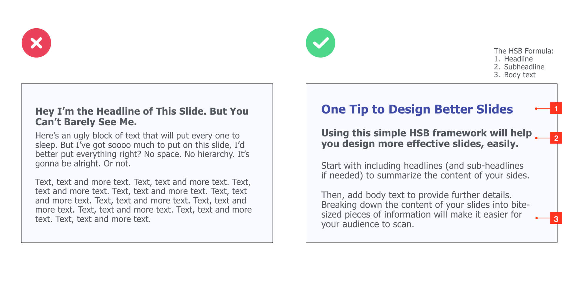
Of course, this is just a framework. You can adapt it depending on your needs. For instance, you could avoid using a sub-headline, but include a visual or graph to illustrate the point you are trying to make.
Embed Your Headline Into a Colored Rectangle Shape
This simple tip will help you highlight the core message of every single content slide. To apply it, make sure to follow these two design principles:
- Contrast: the color of the rectangle shape clearly contrasts with the background color of your slide
- Repetition: use this lay-out across all your content slides for maximum consistency
Here’s an example:
Slide deck made by Nadya Khoja
Embed Icons and Shapes to Illustrate Your Point
Illustrations such as icons and shapes can help you convey information more effectively.
Here are a two concrete examples:
Here are great icon resources:
Grab my favorites here (w/ examples on how to use them) ❤
Flaticon
Freepik ❤
Icon Finder
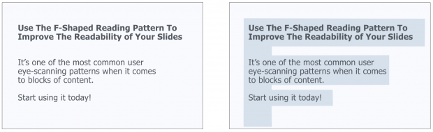
Use the F-Shaped Pattern
Research shows that users usually scan, and read, the content areas of web pages in a F-Pattern layout:
Basically, our eyes are starting at the top-left corner, scan horizontally, then drop down to the next line and do the same until we reach the bottom.
This F-shaped reading pattern is usually in web design best practices, but since presentations are also digital assets that are often viewed on screens, you can also apply it to your slide designs.
Here’s an example:
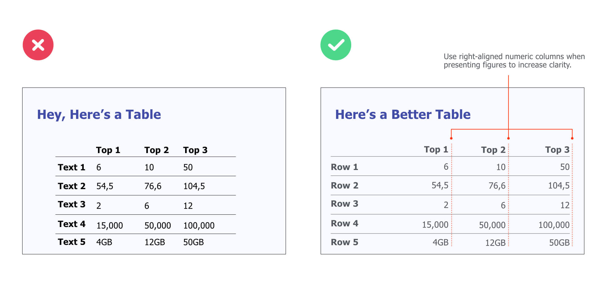
Use This 3-Point Rule to Display Data the Right Way
It’s not secret that tables can be hard to read (especially when there’s a lot of information). So the question is:
How can you create better tables that are easier for your audience to read?
Here’s a simple, effective rule you can use:
1. Numerical data is right-aligned
2. Textual data is left-aligned
3. Headers (column names) are aligned with their data
Reverse-Engineer Beautiful Web Pages’ UX
The point here is to reverse-engineer web page designs you like, identify the common patterns, and create slide designs inspired from them.
Here’s how to do it:
1. Create a “Swipe file” folder on your computer desktop
2. Add screenshots of web pages you like. It can be homepages, product pages, career pages… Any design you like that could be used to create presentation slides
3. When designing your slides, pick a screenshot you like, identify the most common patterns and copy them
Let’s take a look at the example below:
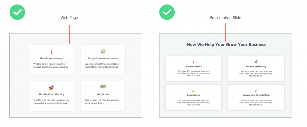
The left visual is a screenshot of a career page where the company basically highlights the peeks they offer.
The right visual is a slide that presents services a digital company offers to potential clients.
See, we have used…
The same lay-out (4 boxes)
Similar colors and shade effects (white, slightly blurry box borders)
The emojis to illustrate the content of the boxes
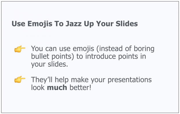
Embed Emojis Your Own “Swipe File” to Be More Creative
Speaking of emojis… 🤗😍👉
Integrating emojis in your slides is an effective (and creative) way to convey feelings while bringing freshness to your presentation designs.
For example, you can use them to introduce paragraphs in your body slides:
Or introduce yourself:

Slide deck made by Alexander Huth
Create Your Own “Swipe File” to Be More Creative
Create a folder on your desktop or inside your cellphone and title it “Swipe File” Anytime you see a beautiful design or great copy, just add it to your swipe file. Set up individual folders or labels (E.g. “Great Cover Slides”, “Headlines”, etc).
Pretty soon, you’ll have a repository of inspiration that you can tap into when you are working on your own presentations.
Here’s how my personal swipe files looks like:
Invest in Presentation Templates
Ready-to-use templates help you create great presentations fast (and at the fraction of what a designer would cost you).

Most templates include everything you need, from gorgeous, easy-to-edit slides and icons to charts and ready-made color themes. In this article, I am reviewing my favorite designer-made PowerPoint and Keynote bundles that’ll help you clearly and concisely present information.
Plus, many business templates include fully editable graphics you can use to illustrate your slides in a professional manner.
For instance, I’ve used the graphics of Massive X, one of my favorite templates, to illustrate the chapters of this presentation guide.

CHAPTER 5:
Public Speaking Tips & Techniques to Deliver Like a Boss
In this section, I will share practical public speaking tips and techniques to help you impact with your voice, words and posture. You will learn:
 Strategies to build confidence in public situations (no matter how nervous you are)
4 powerful ways to start a presentation and connect with your audience easily
Advice on body postures to create a strong executive presence
And more!
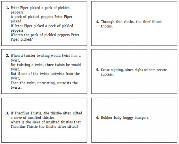
Use Tongue Twisters to Warm-up Before Your Speech
Using tongue twisters helps you practice speaking clearly and enunciating properly. The idea is to say them slowly, and then progressively as fast as you can without making mistake.
Here’s an example from The King’s Speech movie:
Here are a few ones to help you warm up:
Start With a Story
“Stories are remembered up to 22 times more than facts alone.” (source)
 A story is a “connected set of events, with a beginning, a middle and an end”. According to Stanford professor Jennifer Aaker, stories are important for three reasons:
They shape how others see you… as they influence how others see you, whether they want to hire you or buy from you.
They’re tool of power… because people slow down and listen to what you’re saying.
Stories persuade… because they can be a tool to advocate for your idea, your cause, your company.
To craft an effective story for your speech, Jennifer Aaker advises you to incorporate these 4 characteristics:
Goals: why you tell the story in the first place?
Attention: why would the audience want to listen?
Engage: why would they care?
Enable action: why would they want to share the story?
Let’s take a look at a good story:
“Five years ago…. I was….”
“You can’t imagine what happened to me yesterday”
Throw in a Provocative Statement (or a Question)
This is a great way to hook your audience right off the bat.
Here’s an example:
Integrate Statistics/Quotes in Your Opener
Another powerful way to start a presentation is to use statistics.
Here’s an example:
“I want to get started with two facts: it takes 7 seconds for people to decide if they like you, and it takes 30 seconds to decide whether they want to listen to you or not. So by now you already know if you like me or not, and you’re just about to decide if you want to listen to what I’ve got to say”.
To find reliable resources, head over to Google and try these search strings:
- site:edu + “your keyword” + “data”
- inurl:research + “your keyword” + “statistics”
- ‘your keyword” + “expert quotes”
For instance:
Make a Huge Promise (GTS Formula)
Use the GTS (give them something) formula to get your audience excited about what they’ll be able to do or know by the end of your speech.
Here are simple scripts you can use:
You will get / learn / discover [ specific thing(s) ]
Today, I’m going to show you [ statement that benefits your audience ].
By the end of this presentation, you will [ result they’re interested in ].
For instance:
“Today, I’m going to show you how you can use conversion optimization to triple your sales in less than 6 months”.
“My name is Clemence, founder at PPTPOP. In just a moment, I am going to show you how to deliver solid presentations that get your message across, influence and get you more of what you want in front of any audience.”
Share a Plan to Map the Content of Your Speech
A plan makes it super easy for your audience to follow through. The point is for them to SEE where you are at in your speech , at any time.
For instance:
“Today I’m going to show you 4 steps to deliver amazing presentations”.
And you’re talking about step # 2.
They instantly know you’re at the middle of the speech.
Stand Facing the People You’re Talking To
Always:

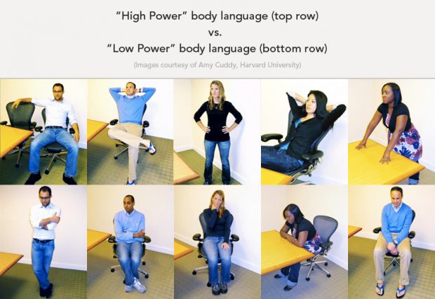
Use High-Power Poses to Instantly Feel (and Look) More Confident
According to Harvard Business School professor Amy J.C. Cuddy, high-power poses decrease cortisol (AKA “the stress hormone”) by about 25% and increase testosterone by about 19% for both men and women.
To do that, make sure to stretch out, open up and make yourself taller.
Use Eye Contact
Eye contact is crucial to keep you and your audience engaged:
- Spend just a few seconds with each person you’re looking at
- For bigger lecture halls, make sure to use an “M” or a “W” pattern to spread eye contact throughout (source).
Keep Moving
“Human beings are drawn to movement. If you move when you speak, you’ll get people’s attention”.
Move toward the audience before making a point. Move away when you want to signal a break or a change of subject.
You can also use space to reinforce your ideas. For example, if you’re presenting three issues, talk about each of them from a different physical position”. Carole Kinsey Goman (via Forbes).
Use These Tricks to Increase the Power of Your Speech
Julian Treasure, a sound and communication expert recommends you to apply the following techniques:
If you want to add weight to your speech, lower your voice
Slow down your pace to emphasize on a point
Speak louder to emphasize a point
Use Pauses to Add Expression and Feeling to Your Speech
“Pausing is to speaking as punctuation is to writing.”

Look, pauses are super important because they reduce the overall rate of speaking, give the audience time to reflect + absorb what you’re saying and tell your listeners you are moving from one thought to the next. Here are a few tips from the presentation coach Diane Windingland:
- Pause before and after important/difficult words or concepts
- Pause after changing visual or slide
Use a Conversational Tone
Verbal presentation skills are crucial to your success and there are two things you should do to increase engagement with your audience:
First, use the words “you” and “I” so your audience relates with what you’re telling them.
For example:
You know that feeling when… [SITUATION]. I think it’s amazing, don’t you?
You’re stuck in [PROBLEM], you’re dealing with… [PAIN POINT]… You know what? I feel your pain.
Let me be completely blunt with you, if you’re serious about [BENEFIT THEY WANT]…
Using sensory phrases while you’re presenting will help you get your audience to feel something:
Does it feel like….
Can you imagine…
Let me show you…
Eliminate Filler Words (AKA the Dreaded “Um”)
Since being kids, we’ve been conditioned to answer questions immediately. And that’s why we’re using filler words such as “uh”, “um”, “well”, “like”… that make us look super dumb and unprepared.

Here are a few ways eliminate these words from your vocabulary:
- Video / audio record yourself to find out how bad it really is. If you’re aware of it, you can work on it
- Don’t speak while looking at your notes (look at your notes, look up and THEN speak)
- Be silent while you are trying to come up with the right word
- Apply the PTA formula: Pause, Think, Answer
Talk About What Matters The Most At The Beginning
Mention what’s important or complex at the beginning of your speech if you can. Here’s why:
“For the first 5-10 minutes of a typical 50 minute lecture a student remembers a high proportion of the information presented, after which the proportion of information preserved rapidly declines. Students typically retain 70% from the first 10 minutes of lecture, and 20% from the last 10 minutes . Source.
Use the SDT Principle
Here’s a good strategy for improving your public speaking skills:
Show don’t tell (SDT).
The SDT principle has one purpose:
Enable your audience to experience the story through action, words, senses, and feelings. Incorporate as much as you can the use of specific, personal stories, vivid details that enable people to picture what you are saying.
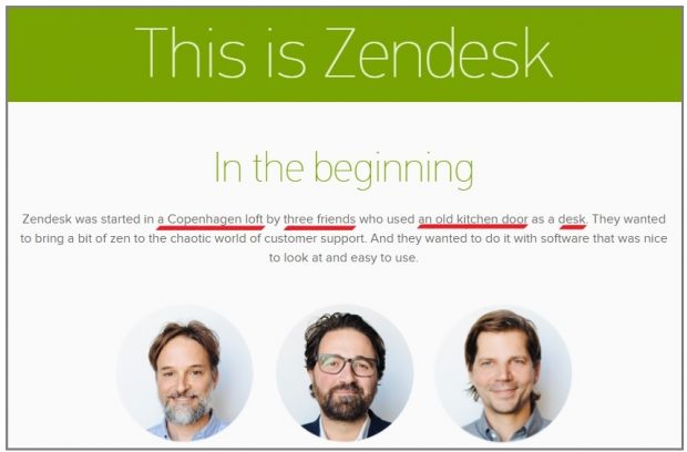
Here’s an example from Zendesk customer service software:
Don’t Read (Here’s Why)
Here’s the problem with reading presentations:
People KNOW you’re reading.
And as soon as they know it, the way they receive your talk will shift because your intimate connection with them will evaporates, and everything will feel a lot more formal (did I say boring?).
Record Yourself
What gets evaluated get improved.
Record your speech either on your phone or with video (video is better, as you’ll be able to pay attention to your facial expression, gestures and body movements). Then listen to it or watch it, and make notes on how you could improve it, specifically:
What errors are jumping out quickly?
Which phrases sound good and which just look weird?
How about the speed?
How about my voice?
For example:
“Mmmm… the intro was too long and boring” -> Let’s focus on mentioning only X, Y and Z before introducing the plan of my speech instead.
“Mmmm… I’m using way too much filler words” -> Let’s record myself once more, but this time speaking more slowly and using pauses.
Join Toastmasters & Improvisation Teams

Toastmaster clubs are groups across the world dedicated to helping members improve their public speaking skills. Groups get together during lunch or after work to take turns delivering short talks on a chosen topic.
The more you present, the better you’ll be, so consider joining a Toastmaster club to become a top-notch orator. They’re literally everywhere.
Improv comedy is also a great way to feel more confident in public.
Watch TED talks
Watch TED talks that cover a topic you’re interested in. Then, think:
Did I like this speech?
If no, why not? If yes, why? What can I learn from this speaker and apply to myself?
CHAPTER 6:
Presentation Tips Infographic
Short on time?
I’ve put together a solid infographic that recaps all the presentation tips in this article in a short and illustrated way.
Plus, the infographic includes dozen of practical keyboards shortcuts you can use to make your slides faster: how to align elements, format your text, insert links, and so on… (I’ve included shortcuts for both PowerPoint and Keynote).
These shortcuts are a real time saver.
Here’s a minuscule version of the infographic:

If you’d like to get the whole, high-res version, I’ll just ask you to share this presentation guide on your social network. 😍
First, I know you have influence and that when you share something, people pay attention.
Second, I am giving it away in exchange of some sweet traffic to my website (Look: you can still delete the post on your social media account if you really believe this infographic and guide have brought little or no value to you).
Deal?
Simply use of one of the share buttons to access your slides instantly.
You’re awesome! 🤗
What to Do Next 👉
If you liked this guide, consider subscribing to PPTPOP’s newsletter.
If you want to make gorgeous, professional presentations – for your boss, a high-stake client or even investors – but you have no time and budget to make it, then what I have below might be of some interest to you.
Pre-built templates let you create beautiful presentations like a real pro, at a fraction of the time you’d usually need if you made the whole deck yourself (and no, it won’t take crazy design fees).
Meet Massive X, The Ultimate All-Purpose Presentation Template
With endless design possibilities, functional slides and a recent bundle update, Massive X toke the business of presentation templates to a whole new level of professionalism and creativity.

Of course, this PowerPoint template offers a lot of what’s expected from a premium bundle:
Practical, clean slide lay-outs, tons of content elements that’ll help you tackle any type of presentation faster. But that’s not all:
There’s one feature I absolutely love about this bundle and I’ll get to that in a second. But first, let’s check out their quick introduction video:
Now, you might want to know the one thing I love about this template (I love it so much I’ve sparkled it all over the chapter introductions of this guide)?
Their gorgeous, 100% editable illustrations:
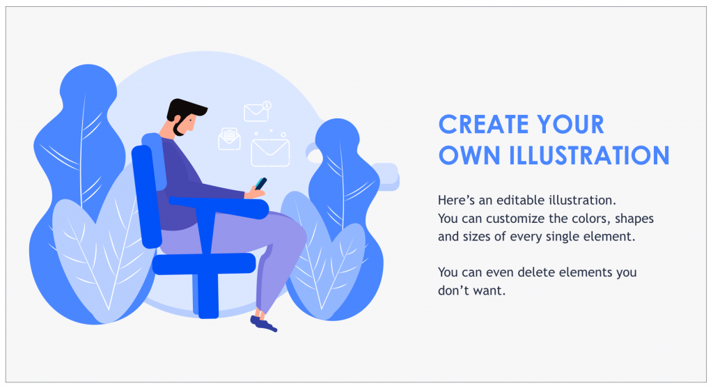
Fully Editable Illustrations
Why 100% editable?
Well, because these illustrations are made out of multiple, individual elements that are then put together. And you can edit the color, size and shape of every single one.

Now, what’s so powerful about that?
It’s simple, you can customize every single illustration according to your colors. Company colors, or just colors you wish to use for a specific purpose. The choice is yours.
And the great news is, Massive X comes with a ton of editable illustrations you can use for multiple purposes:
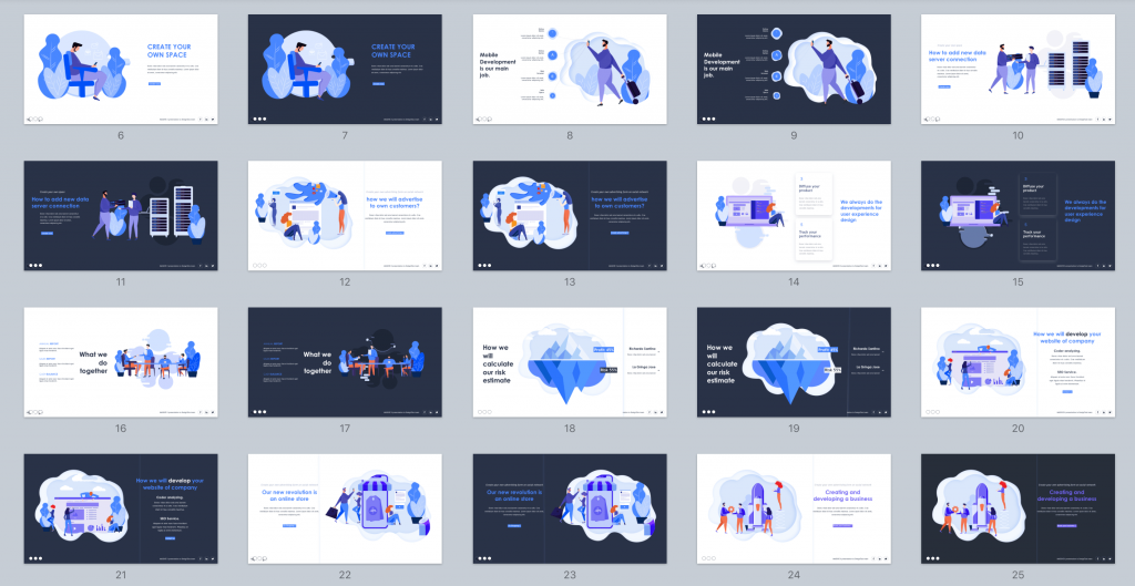
Now, let’s take a look into the details of the bundle…
Key Features
- 290 unique PowerPoint slides
- Animated slides
- 12,000 icons
- 15 color variations
Pros & Cons
- A very versatile bundle
- 100% editable, beautiful flat graphic designs
- Embedded slide animations and effects (you can decide to use them or not)
- Fast and friendly customer support
- Only available for PowerPoint (though it works well on Keynote, I’ve tried it myself)
Affiliate disclosure. PPTPOP is a participant in the Envato Affiliate Program, and we get a commission on purchases made through our links (it doesn’t cost you anything).