This is the best PowerPoint title slide tutorial on the Web. Period.
In fact, you’re going to learn a simple, 3-step process to designing gorgeous and professional presentation cover slides that get your point across. In 5 minutes top.
Let’s dive right in…
How to Make a PowerPoint Title Slide
⚠ Ground Rule:
Anyone, including your grandma, should be able to understand what your PowerPoint title slide is going to be about.
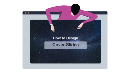
Here’s a concrete example:

In this cover slide, we quickly understand that the presentation will be covering details (very likely tips) on how to build a successful team for your startup.
The 3-Step Process to Making Great Cover Slides
Every presentation title slide has 3 “ingredients”.
Here they are:
👉 The background (your visual, or the color you’ll be using in your background)
👉 The lay-out (where and how you position the different elements in the slide)
👉 The text (usually, a headline and a sub-headline that wrap up what the presentation is about)
The process we’re about to follow will address how to deal with each of these elements.
Let’s do it!
Step 1: Pick Your Title Slide Background
Welcome to Step 1 😀
Here, you basically have two options to chose from:
1) Using a plain color for your slide background (super easy)
2) Using a visual
As you’ve guessed, the first option is the quickest one. And it doesn’t require any brain work at all. So we’re going skip it and cover directly how to proceed with the second option.
If you want to design a cover slide that’ll grab people’s attention, you need to start with asking yourself this simple question:
What’s my presentation topic?
Answer using this formula:
My presentation is about [ X ]. So the topic is [ Y]
Here are a few examples:
My presentation is about [ our yearly financial report ]. So the topic is [ finance ].
My presentation is about [ power supply dynamics ]. So the topic is [ power supply / engineering ].
My presentation is about [ our client’s social media strategy ]. So the topic is [ social media / marketing ].
See where I’m going?
Now that you have a clear topic for your presentation, you’re going to associate that topic with specific keywords. The point here is to find out keywords we’ll be using as search terms when looking for visuals online.
Here are a few examples:
Topic: SEO services
Related elements: Computer (or web traffic, web page, graph)
Topic: Consulting firm business proposal
Related elements: office building (or business people, meeting, investors)
Now that you have a few keywords for your cover slide, you’re going to be looking for a relevant visual.
Beautiful, Free Photography Resources
Pexels (my favorite’s, lots of visuals)
Burst (solid)
Gratisography (crisp, fun)
Death to the stock photo (a bit of everything)
Startup stock photos (genuine-looking)
Unsplash (nature related)
Little visuals (like Unsplash)
Pic jumbo (urban-related mostly)
First, check out the results.
Then, select one picture that closely relates to the identified keyword. If you’re struggling with choosing between various visuals, then ask a few colleagues which one they prefer and go for the most popular option.
💪 Pro Tips
✅ Search keywords that directly relate to your topic in order to find a relevant visual for your cover slide (e.g. finance -> “money”, “charts”, social media -> “phone”, “people”)
✅Download visuals in high resolution (this is especially important if you’re presenting on a screen).
✅ To save time in the future, create a folder on your desktop. Anytime you stumble upon a great visual, just add it to your folder (get more tips just like this one right here).
Step 2: Chose the Lay-Out For Your Text
Now that you’ve found a visual that fits with your presentation topic, it’s time to decide which lay-out you will use to display the title of your presentation on your cover slide.
Here are various text placement options you can chose from: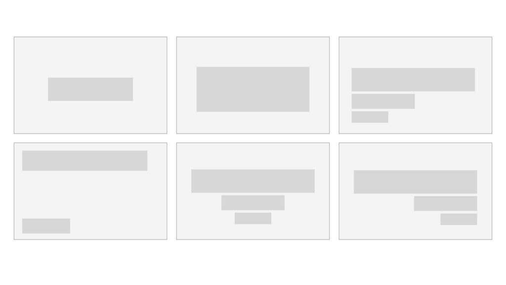
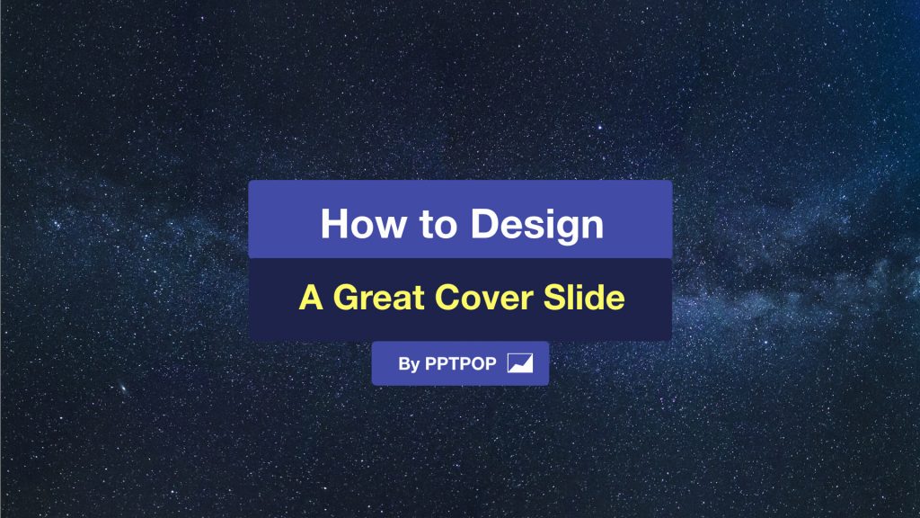
Here’s how it would look like with real examples: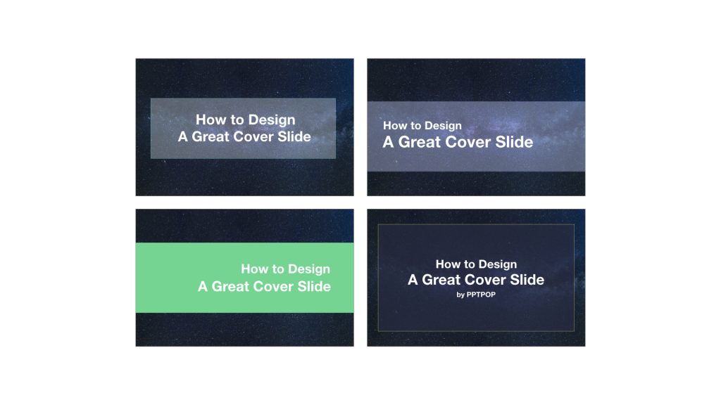
Now:
There’s no right or wrong answer when it comes to deciding which lay out you’re going to use. I recommend you to make sure there’s the minimum amount of text possible on your cover slide for three reasons:
👉It’s easier to design a good looking introduction slide when there’s not too much text
👉No one want to be bothered by a wall of text straight off the bat
👉You need to be able to wrap up what your presentation is going to cover in a clear and concise way
Your title slide shouldn’t have more than a headline (that resumes the content of your deck in a sentence), a name (yours or the one of your company), and a logo or a date.
With that said, on top of choosing your lay-out, you’re going to have to chose whether you want your text to appear directly on top of your background or not. Here’s a simple rule you can follow:
⚠ For plain color backgrounds: add your text on top of the background or integrate it on top of a rectangle/rounded shape
⚠ For visual backgrounds: to make sure your text can easily be read by your audience, add a shape on which you will display your title text
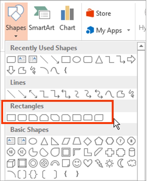
Of course, you can select other shapes such as these ones:
You can also customize your text bar playing with both color and transparency.
Adding transparency allows people to see the whole visual behind. But use it with care: your first priority is to get readers to feel comfortable when looking at your slides.
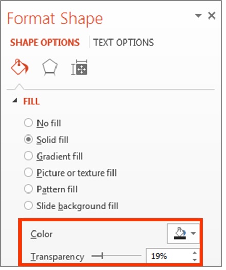
Contrast is the king. Dark shape = light/flashy colors for the text. Light shape = dark colors for the text.
Step 3: Integrate Your Title Text
I recommend that you create one text box per line. You’ll be able to customize both font size and overall style easier. Either align the text (to the left, the right or the center) for maximum coherence.
Here are three simple techniques you can use to create contrast and maximize the visual impact of your text:
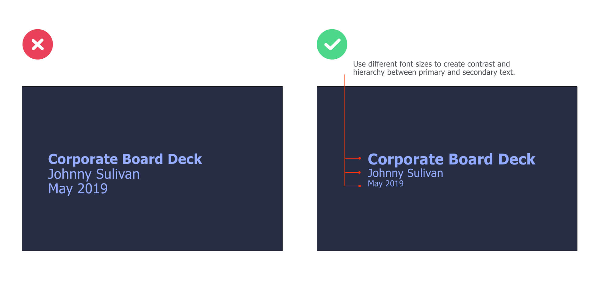
Use Different Font Sizes to Create Hierarchy
Modifying the font sizes is a great way to control the hierarchy within your title slide. Plus, it helps your audience to immediately identify the important content from the less important one.
Now, the great news is that you can apply this technique on all types of slides. And it works especially well on cover slides.
Here’s an example:
 Modify The Color of Specific Keywords
Changing the color of specific keywords you want to highlight is another great way to control the hierarchy (and contrast) within your slide.
Here’s an example:
Change the Typography of One Part of Your Text
On top of changing the color, you can also change the typography (a.k.a. the font) of a specific part of your text to draw attention toward it. You can combine this technique with the previous one for even more impact.
Here’s an example:

On this slide, we’ve used a different font for the “an amazing” text. On top of this, we’ve modified the color and embedded a rounded shape in the back.
Change the Color of the Shape On Which You’re Putting Your Text
This is another great and powerful way to create beautiful title slides for your presentations:

Free & Creative Font Resources
The top 10 fonts web designers love (free and paid)
Font Squirrel ❤
Fonts2U
Dafont
💪 Pro Tips
You can even add emojis to your cover slide text !
Get all your emojis here, and paste them directly in your text box.

⭐ Want to speed up your cover slide design process? Download this Cover Slide Template where I’m sharing the cover slide text lay outs I’ve used in this article.
Case Study: How I Made The Cover Slide Below
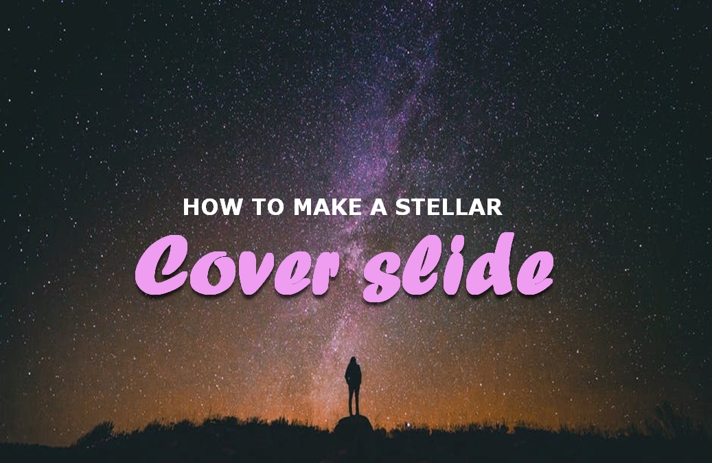
Step 1: Find a Visual Related to The Topic Covered
Finding the right image is the key step of your presentation title design process.
Here, I wanted to illustrate what a great cover slide can look like. So I started to think: “Well, what do I mean by great… How can I show what a great cover slide means?”
And then I came up with words that are tied to the emotion I want to convey:
“Gorgeous”
“Beautiful”
“Stellar”
BOOM! I got it.
The keyword “stellar” that just translated perfectly what I wanted to communicate.
So then, I headed over to Pexels and typed “stellar”. But no free resource came up, so I tried “sky” instead (pro tip: head over to Thesaurus to find synonyms):
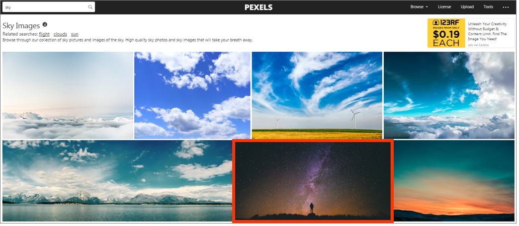
Got my visual.
Now, it’s time to move on to step 2.
Step 2: Chose the Text Lay-Out
I opted to place the text in the center of the image. I decided not to use a rectangle shape to put my text on. Why? Because the visual was pretty plain itself and it was easy to read my text on top of it.
Remember:
If you can’t read the text easily on your cover, add a rectangle shape in between your visual and the text.
Step 3: Add the Text
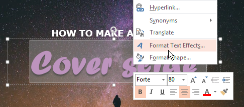
I used a font called Forte for the “Cover slide” part.
For the word “cover slide”, I customized the text style with shadows (select the text -> click right > “format text effects…”) and play with the options until you get something that satisfies you.
Are You Spending a Lot of Time to Make Presentations? 
For less than the price of a movie ticket, you could get immediate access to dozens of designer-made, beautiful slides at a fraction of what a designer would charge you (for just an hour of work).
If you want to make presentations that people will remember, then you should consider PPTPOP’s getting pre-built, fully editable template kit. Use it to:
- Present clean slides that grab – and keep – people’s attention
- Confidently expressing ideas, concepts and messages with visual elements.
- Wow your prospects, get them to walk away knowing you’re the pros and eliminating other options.
Create gorgeous slides that get their message across in a fraction of the time it normally takes.
The presentation kit includes fully editable slides, graphics, and illustrations that work in the real world. If this sound like something that could help you, check out the details below.