Welcome to a huge resource on presentation design.
And let me be clear about something:
This is not another article loaded with obvious advice like “be consistent” or “use high-quality visuals”.
Instead, this guide is jam-packed with practical tips, techniques and ideas (illustrated with real examples) to help you design irresistible presentations from start to finish.
Let’s jump in…

The Definitive Guide to Killer Presentation Design
This guide is divided into three parts:
 Part. 1: Presentation Design Principles. From choosing the perfect colors and fonts to leveraging simple design best practices (like “Grid systems”), you’ll learn exactly how to start your presentations off the right foot.
Part. 2: Presentation Design Tips. In this section, you’ll learn how to improve the structure and clarity of any presentations (and I’ll also share powerful data visualization tips so you can present numbers in a non boring way…).
Part. 3: Advanced Presentation Ideas & Techniques. From creating gorgeous text effects and colorful shapes to using emojis, you’ll learn creative design ideas and techniques that’ll make you (and your slides) look amazing.
Let’s do it!
PART 1
Presentation Design Best Practices and Principles
Here are some of the things you will learn in this section:
👉 The 3 questions you MUST answer before starting to design your presentation
👉 How to create effective, audience-tailored color themes (including free tools and resources)
👉 The proven, most readable fonts for your presentations
👉 Simple principles of what makes something beautiful or functional (learn how to use “grid systems” or the CRAP principle to your advantage)

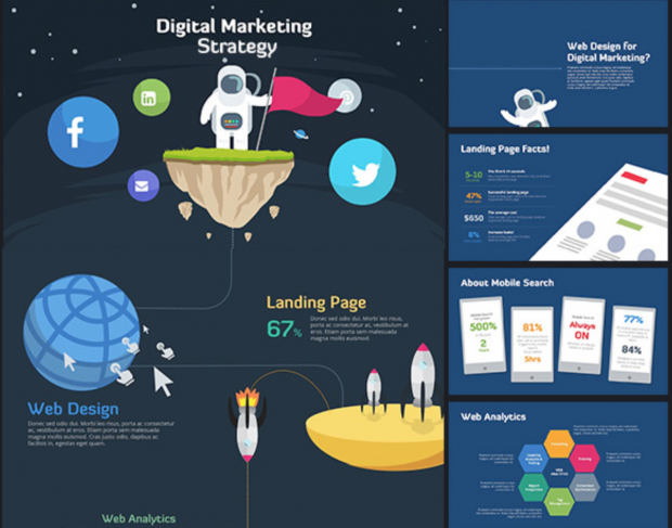
Get this 100% editable PPT illustration (along with many more) here
Use This 3-Item Checklist First
Let’s be honest:
Great design won’t cut it if your presentation hasn’t be prepared effectively first. So to ensure you’re starting off on the right foot, make sure you have identified:
- A specific goal for your presentation (Example: “I’m doing this presentation to convince my boss to double our advertising budget next quarter”)
- Who your audience is (Example: “B2B company C-level execs”)
- In which category your presentation falls into (Inform/Persuade/Educate). Example: “Q4 Sales Results” -> Inform; “Webinar: How to Get More Organic Traffic” -> Educate; “XYZ Company: Investor Pitch Deck” -> Educate/Persuade)
Quick Power Note 💪
If you want to design gorgeous slides fast, you’d be crazy not to check out PPTPOP’s premium template pack. It’s a set of ready-to-use slides you can use right away to make your presentations look 10x better. See details here.
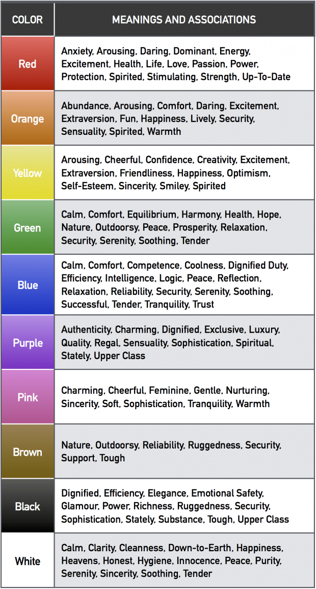
Use This Color Meaning Table to Create a Consistent Presentation Theme
Your presentation colors should be:
- Associated with your organization (color increases brand recognition by up to 80%. Source)
- Aligned with your audience’s characteristics (76% of women prefer cool colors compared to 56% of men).
- Limited to two or three colors (because “the colors should be used to accentuate the information, not be the center of attention”). I recommend to use dark grey for your text, and then up to two additional, contrasting colors, either for headlines of specific info you want to highlight (e.g. figures or findings).
Below, you’ll find a research-backed table that details all color meanings and associations.
Use it to find the colors that work for your presentation:
Color Inspiration Tools ✨
Here are my two favorite resources when it comes to building color themes:
StylifyMe. A site website analyzer that allows you to check the style guide of any website, including colors, fonts and sizing. Great to give you a solid boost of design inspiration!
Kuler. A free color palette generator that’ll help you either build your own color palettes, or chose from thousands of pre-built schemes.
Okay…
So you’ve chosen your color theme, that’s awesome.
But that’s not enough:
How can you actually guarantee you’ve made a good job at integrating your colors in your slide deck?
There are two ways to make sure you’ve done a good job at “sprinkling” your chosen colors in your presentation…
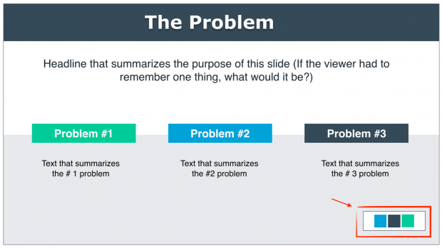
Embed a Friendly Color “Reminder” in Each Slide
Embed a shape that includes the colors you’ve chosen for your presentation at the bottom corner of each slide.
Create rectangle shapes, color each of them with the colors you chose for your slide deck, group all your shapes, and copy paste it on each of your slides.
Here’s an example:
Use the Slide Sorter Tool to Ensure Your Color Theme Is Rock-Solid
View your deck in a “slide sorter” (PowerPoint) or “light table” (Keynote) mode and double check if you – or even better, if a colleague – can clearly identify the most used colors.
It should be a no-brainer.
Here’s an example for the this pitch deck template:
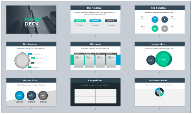
In this slide deck, it’s super clear that the theme is made out of three primary colors:

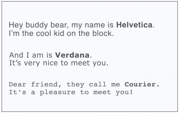
Use One of These Most Legible Fonts
What font should you actually use?
Well, let’s take a look at what the data says:
The Software Usability Research Laboratory has demonstrated that the most legible fonts are Arial, Courier, and Verdana.
Research also shows that the following fonts are good for people with dyslexia: Helvetica, Courier, Arial, Verdana.
Pro Tips 💪
People are more likely to engage in a given behavior the less effort it requires (Source). That means your text size should be big enough to be legible to the person seating the farthest from your location.
To validate your font size: put your presentation file into the “slide sorter” (on PowerPoint) or “Light table” (Keynote) view. Then, look at the slides at approx. 66% (PowerPoint) and 160% (Keynote) size. If you can still read them, so can your audience.
Now, here’s a great font resource:
Use Grid Systems
Grids are the invisible glue that holds a design together. Using them will help you design professional looking, well-structured slides for your presentations.
Here are proven grid models you can use to organize your slides:
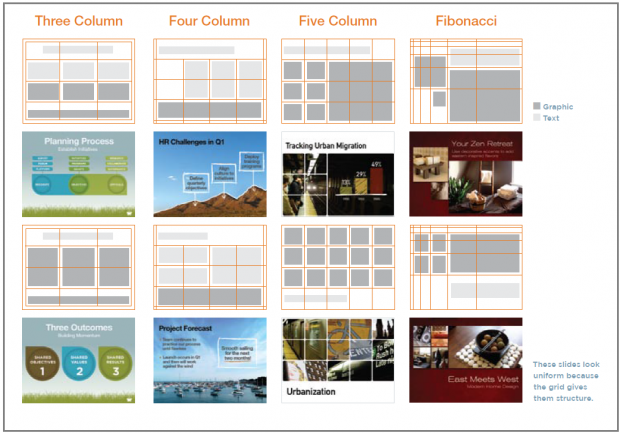
Grids help you position both text and visuals more precisely because they’re providing an invisible spine to which they can align.
Here’s an example:
Here’s the grid model I used to design this business slide:
Apply the CRAP Principle
There are not a hundred but one principle of design that I want you to get under your belt.
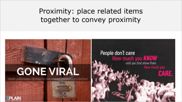
The CRAP principle: Contrast, Repetition, Alignment, Proximity.
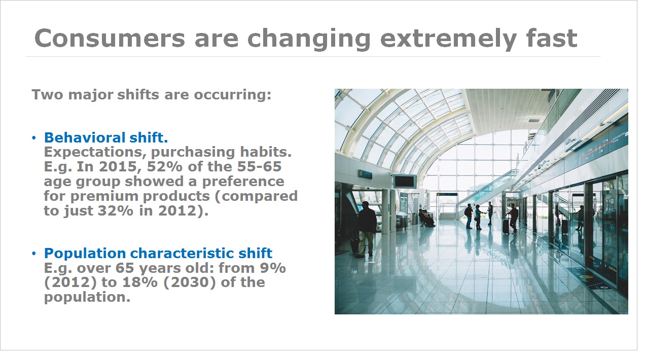
Contrast is all about making things stand out. It can be achieved using three major tactics: manipulation of space (near / far, empty / filled), color choices (dark vs. light / cool vs. warm) and text (typography style / bold vs. narrow).

The AI Rush by Jean-Baptiste Dumont.
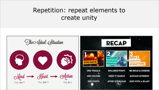
Repetition, for instance making a headline and a sub-message the same color, makes scanning your deck much easier. Repetition helps you create a cohesive look to your presentation.
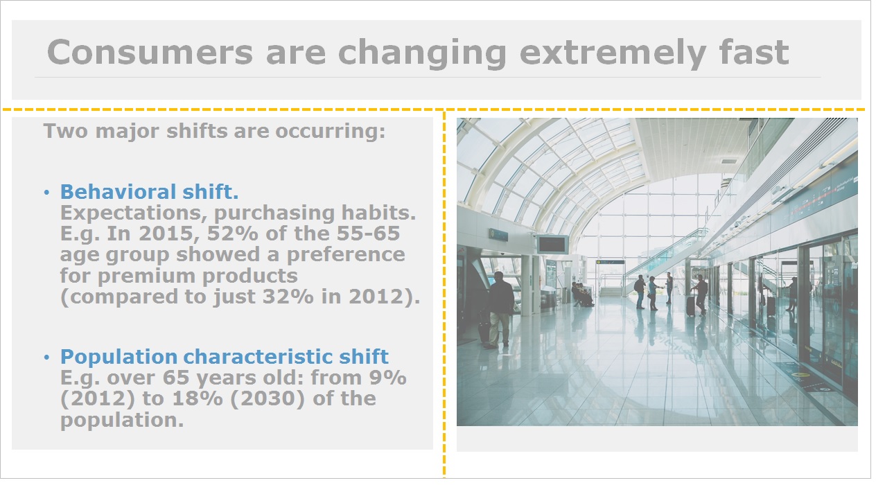
Alignment. Newspapers use this to great effect. Aligning a whole bunch of elements with one another makes them scan faster. Alignment makes things easier to read.

Proximity means that things are associated with one another. Let me explain that for you: the closer things are, the more they are associated The farther they are away from one another, the less they are associated.
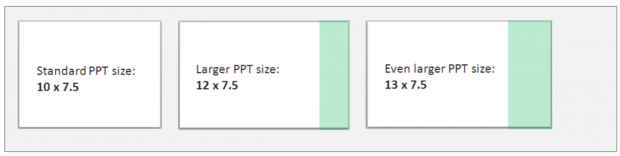
Customize the Size of Your Slides
Standard presentation slides are usually sized 10 inches (width) * 7.5 inches (height). Re-size yours 12*7.5 (for PowerPoint) or Widescreen 16.9 (for Keynote).
The idea here is to have more horizontal space, meaning more freedom to design your slides:
Here’s how to do it:
- For PowerPoint, open a PPT document, go to Design > Page Setup
- For Keynote, go to Document (top right corner) > Slide Size > Custom Slide Size
PART 2
Presentation Design Tips
Here’s what you will learn in this section:
👉 The 4 “types” of slides you need in most business presentations and how to design each of them
👉 Principles and strategies (like the “HSB” formula) to craft slides people can easily understand
👉 Simple shape and color effects you can leverage to make stunning slides
👉 Data visualization techniques to present figures the right way (these all are tips you can implement right way)
And much more!

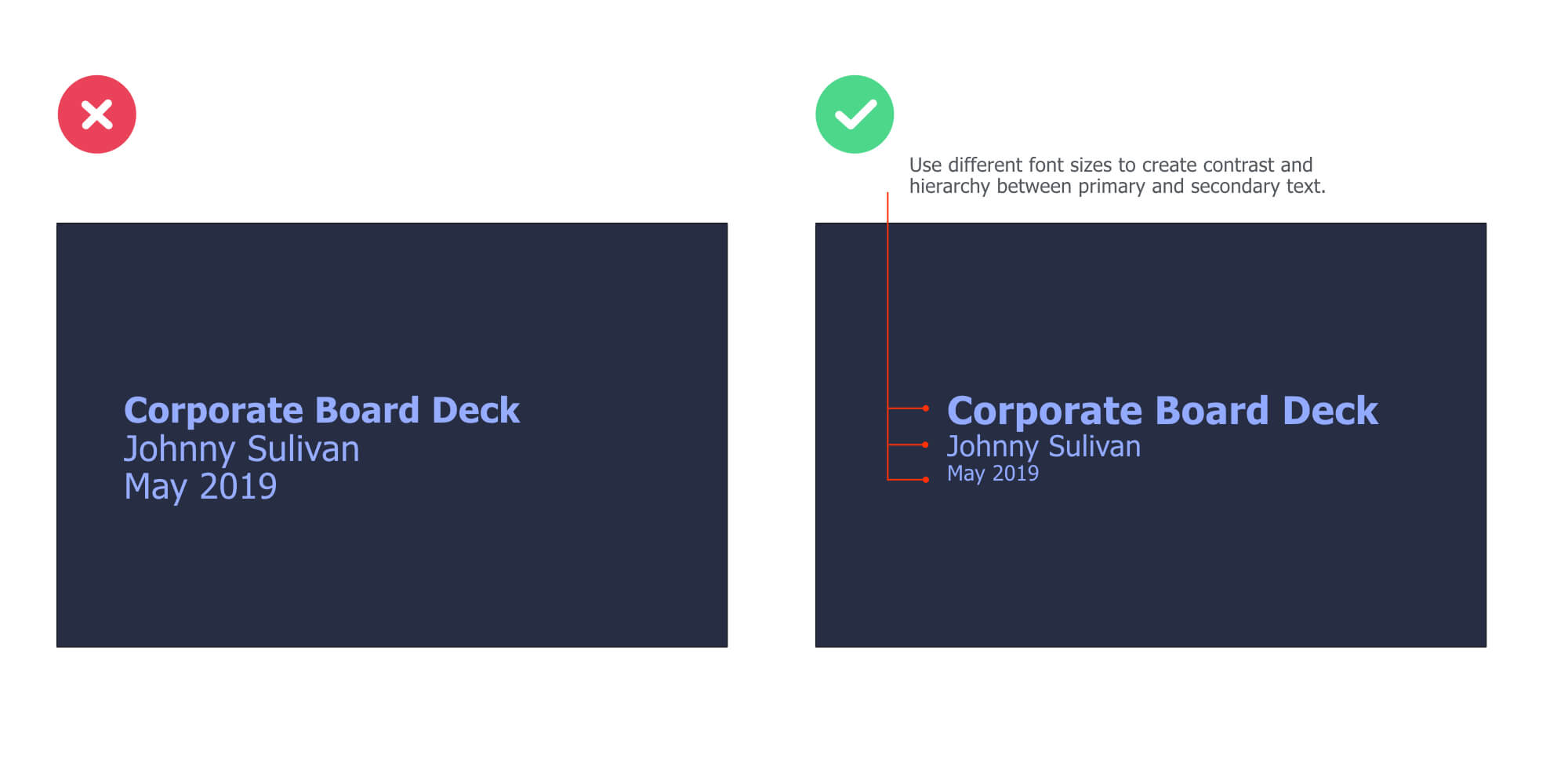
Use These 3 Steps to Design Your Presentation Title Slide
Short on time?
Use the technique below to design beautiful cover slides fast:
👉 Use a plain color for your slide background
👉 Add your text on top of it. Use the Contrast principle to pick the color for your text (e.g. black background =white text).
👉 Use different font sizes to create contrast and hierarchy between the elements. For instance, the title of your presentation should be bigger than the name of your company department (because it’s logically more important).
Here’s an example:
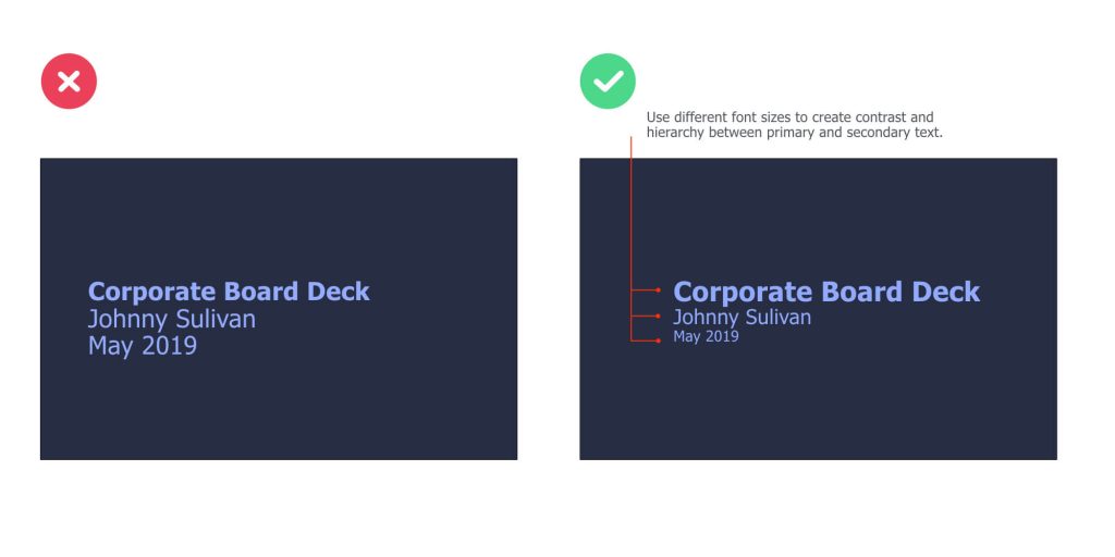
On the left slide, there’s a great contrast between the background and text. However, the different elements of text are of the same size, making it difficult to scan it.
On the right slide, we’re using different font sizes to create a clear contrast between important and secondary information.
The color of the text is based on the color we chose for the slide background:
Use the HSB Formula to Make Crystal Clear Body Slides
For corporate decks and most business-world presentations, the content slides (a.k.a. body slides) will very likely be broken down in 3 core parts: Headlines, sub-headline, body text.
(Hence the HSB Formula)
Now, let’s see what each part actually include (and take a look at a specific example after that)…
Headline
Headlines are concise sentences used to summarize the content of a slide. Good headlines have three attributes:
- Short. A headline must be short to be easily remembered (it should fit into the 140 characters of a Tweet).
- To the point. A headline has to be specific (e.g. use numbers)
- Benefit the audience. Grab people’s attention and help them understand what’s the #1 message of the side.
Subheadline
They are secondary headlines that basically elaborate on the main headline above it. They ‘re optional (don’t include if you don’t need them) and should be used to reel the reader in.
Body text
Body text provides the meaty details. It is usually coupled with visuals and graphs to provide supporting materials and help you get your point across.
As you can see, the HSB formula is quite simple to remember.
Now, let’s take a look at an example:
Headline: Sales Breakdown by Region (Q4)
Subheadline: China accounts for 52% of total sales over the period, representing an increase of 35% YoY
Content: Sales chart details and explanation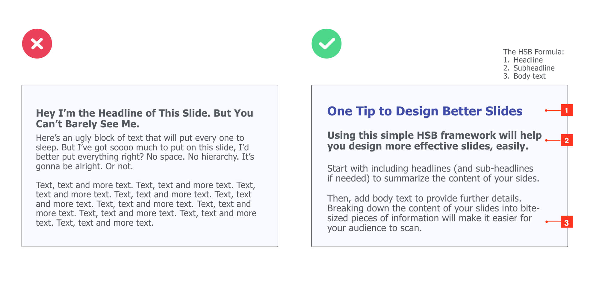
Embed Transition Slides
This works especially well for long-form presentations:
Investor decks, business plans, webinars, annual reports, and so on…
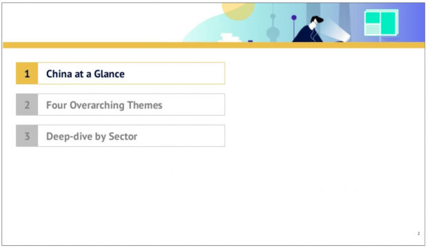
Adding transition slides allow you to clearly separate the different sections of your slide deck, while helping your audience identify where they are in your presentation. You can add crystal-clear transition slides by simply highlighting the text of the section you are about to cover next.
For example:
China Internet Report 2018 by Edith Yeung
This transition slide allows the audience to instantly get two things:
- They’re just about to start the first section (“China at Glance”)
- The presentation has 3 sections.
Another way to design break slides for your presentations is to use plain background colors. And just insert headlines that refer to the topic you’re about to cover next.
For instance:

Working with Big Data by Seth Familian
Pro Tips 💪
Apply the Contrast principle to design effective transition slides. For instance, if your body slides all have a light color background, then make transition slides that use a dark color background. You can also use a bigger font size and change the color of your text.
Bottom line: You can never be surprised by the next slide, it needs to follow naturally.
Add a Closing “CTA” Slide
Close your presentation with a clear call-to-action (which is what you want your audience to do when the presentation is over).
Here are three examples of CTAs:
- Q&A (if you’re doing a webinar or teaching a class to students for instance)
- Contact Us Today at 000-000-0000 (if you’re sending a sales deck to prospects by email)
- Click Here to Learn More About [Topic/Product] (if you’re driving traffic to your website to capture leads)
Here’s an example of a call-to-action by Growth Tribe, a training company that offers marketing and artificial intelligence courses:

Now, if you don’t want your audience to do anything specific, just drop a “Thank You!” along with your name and contact info (email, website, Twitter ID, etc).
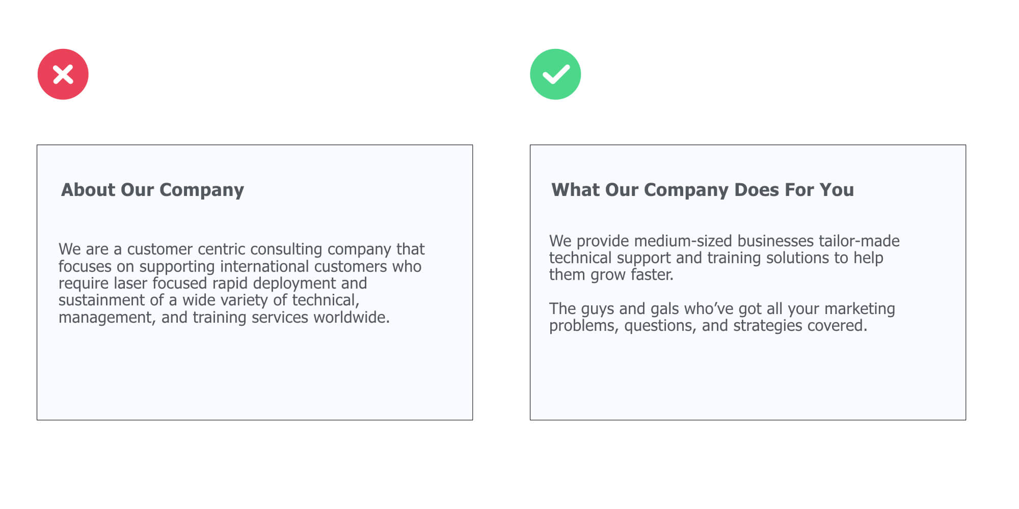
Use Simple Words Everyone Can Understand
Unless you’re making a technical presentation geared toward a technical audience, use simple words people can understand.
See it this way:
People shouldn’t scratch their heads to try to figure out what you were trying to say. They shouldn’t have to think about it. It should be crystal clear.
Now, take a look at the different between a text that’s hard to understand, and one that’s fairly easy:
Stick to One Message Per Slide
Use this exercise to ensure each single slide is focused on delivering ONE core message, idea or concept to your audience:
The purpose of this slide is to [ ____ ]
Here are two examples:
The purpose of this slide is to [ show that our sales increased by 25% this quarter ]
The purpose of this slide is to [ explain to the prospect how our product solves his top 3 problems ]
Use the Grandma Test
Anyone, including your grandma, should be able to understand what your PowerPoint slide is going to be about.
Let’s take a look at an example:

Here, we quickly understand the slide deck will be covering details (very likely tips) on how to build a successful team for your startup.
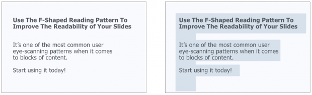
Apply the F-Shaped Pattern
Research shows that users usually scan, and read, the content areas of web pages in a F-Pattern layout:
Basically, our eyes are starting at the top-left corner, scan horizontally, then drop down to the next line and do the same until we reach the bottom.
This F-shaped reading pattern is usually in web design best practices, but since presentations are also digital assets that are often viewed on screens, you can also apply it to your slide designs.
Here’s an example:
Optimize Your Slide’s Layout With Alignment
First, make sure you’re using enough space between the different elements in your presentation slides.
Next, fix your slides to make sure the alignment isn’t off. For example, take a look at the difference between the left and the right slide below.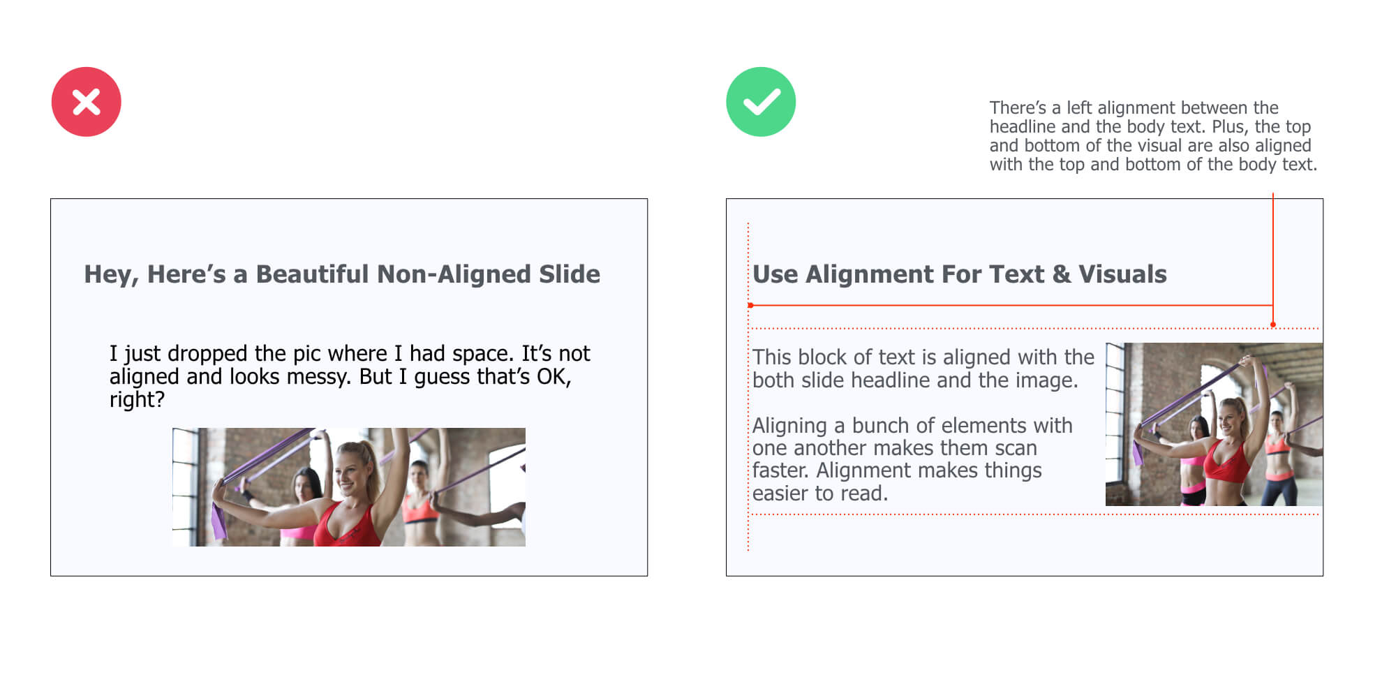 While there’s no alignment on the left side slide, the right slide is clearly structured with different levels of alignment: between the headline and the body text, between the top of the body text and the top of the visual, and between the bottom of the body text and the bottom of the visual.
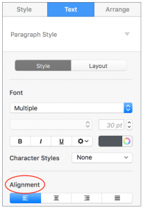
To align elements on your slide, just select the ones you want to align, and then do this with Keynote:
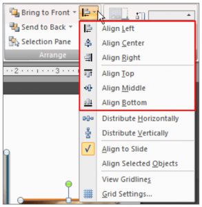
And this with PowerPoint:
Use Color & Weight to Create Hierarchy
You probably already know that modifying the font size is a great way to control the hierarchy within your slides.
But what you may not know is that changing color or font weight is another smart way to separate the important text from secondary one. Here, take a look at the example below:
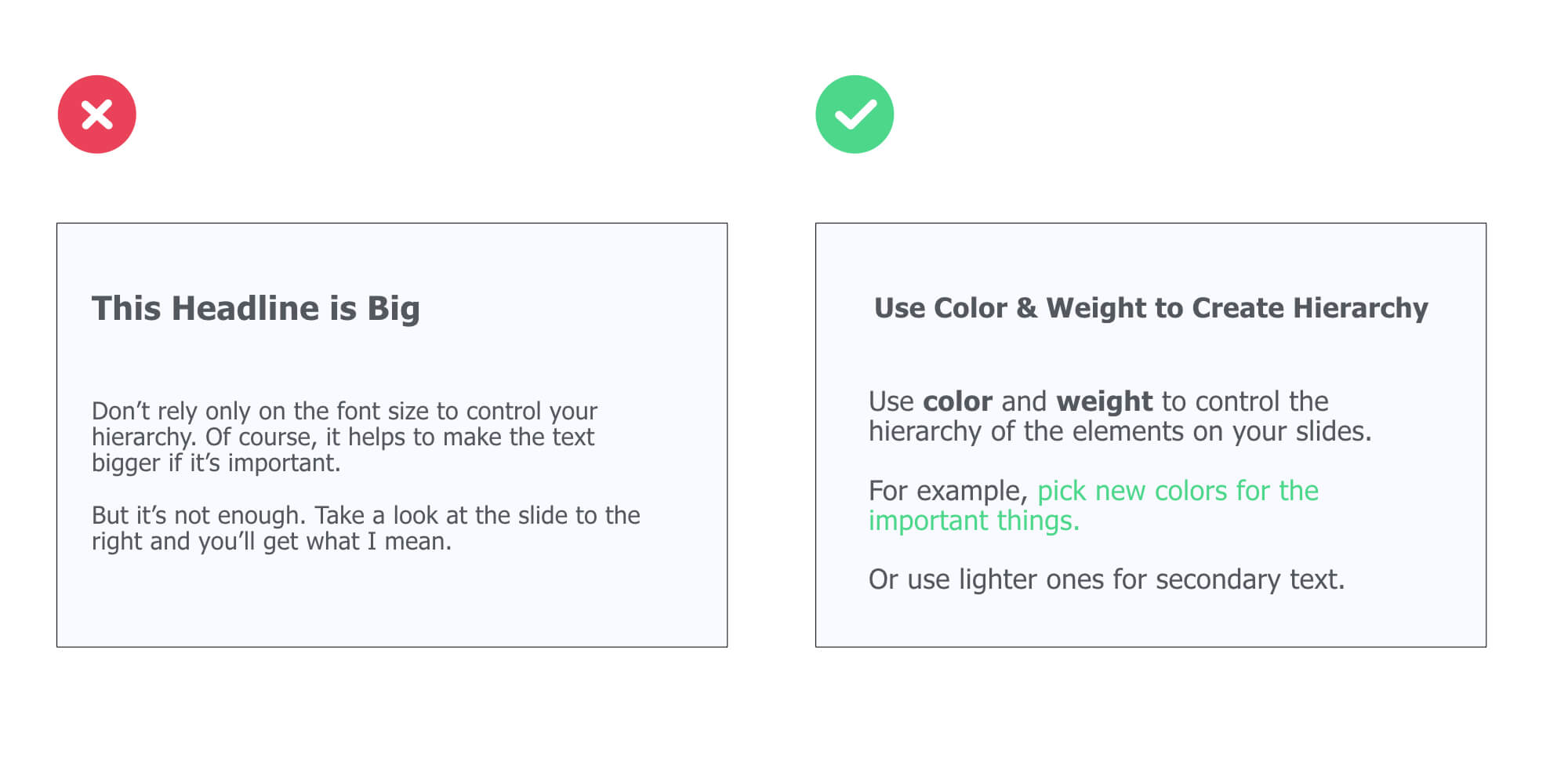 Now, here is a simple rule you can use:
First, chose a dark color for the primary content (such as the headline and body text of a slide).
Then, pick a contrasting color or/and bold font for important keywords you want to bring to your audience attention.
Get to the Point and Use Space
Existing research proves that white space (basically, the open space between elements or objects within the borders of a slide), has an effect on legibility, aesthetics, and people’s emotional response.
First of all, you’re going to delete the content that’s not critical to helping your audience understand your message. To do that, you are going to make sure each piece of content on your slide gets a YES to the two following questions:
“Is adding this [Text/Illustration/Piece of Data] critical to helping me reach my presentation goal?
“Is adding this [Text/Illustration/Piece of Data] critical to helping my audience understand my message (or, how does it benefit to them?)”
Then, after having filtered out what you don’t need, add space between the different groups of elements to make your slides breathe.
Having slides that are clean and pleasant to look at will help your audience scan them easier. And if they can scan your content easier, they’ll understand it faster.
Here’s an example: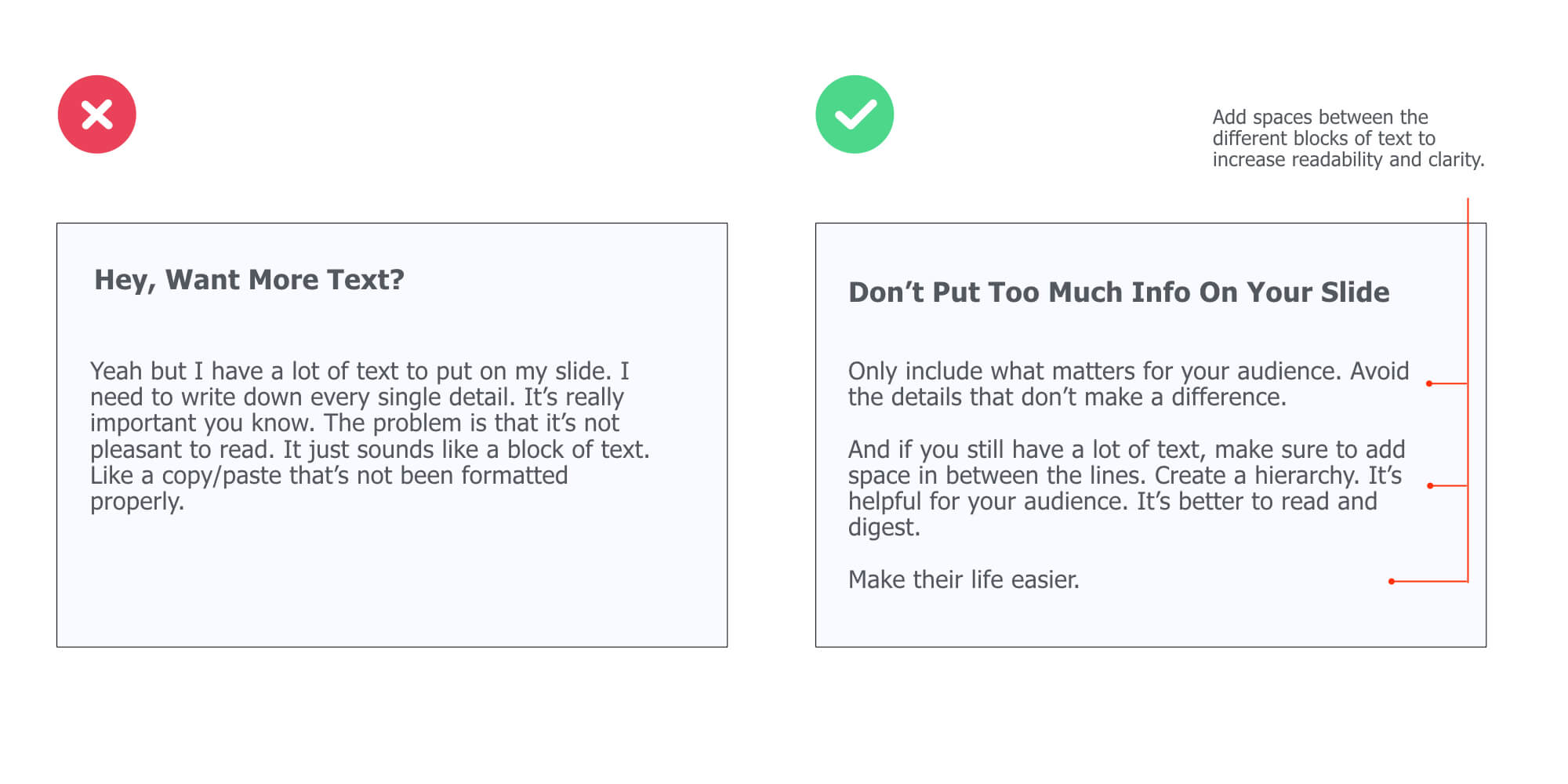
Embed Your Slide’s Headline Into a Colored Shape
This simple technique will help you highlight the core message of every single body slide. To apply it, make sure to follow these two design principles:
- Contrast: the color of the rectangle shape clearly contrasts with the background color of your slide
- Repetition: use this lay-out across all your body slides for maximum consistency
Here’s an example:
Slide deck made by Nadya Khoja
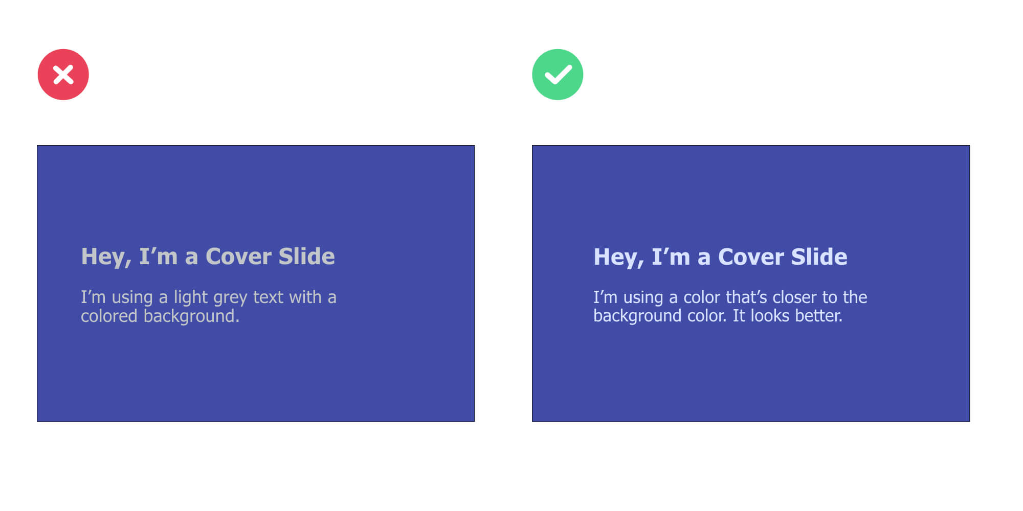
Use a Text Color Close to Your Slide’s Background Color
It’s a simple, subtile design trick that can make a difference:
Using a text color that’s close to your background color. So the point here is to use a text color that’s has 1) a lighter chroma and 2) a lighter value than the original background color.
Now, let me explain:
Let’s take a look at an example:
Embed a Rectangle Shape With Your Text On Top Of a Visual
Here’s a variation of the 3-step technique mentioned earlier:
👉 Use a full-size photography that relates to the topic you will cover
👉 Add a rectangle shape on top of it with your text on of it (and make sure to apply the Contrast principle: if the shape is dark, use a light color for your text, and the other way around)
👉 Use different font sizes to create contrast and hierarchy between elements
Here’s an example:

What’s Next in Growth by Andrew Chen
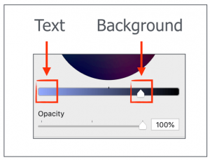
Add a Layer On Top of Your Background Visual
There’s a simple way to guarantee your text can be read easily on any type of presentation background:
Adding a “layer” between the visual and your text.
I’ll explain:
👉 First, find a visual related to your presentation topic
👉 Then, insert a rectangle shape that has the same size of your visual. Put this shape on top of your visual to cover it
👉Play with the opacity of the rectangle shape (I’m using 70% opacity in the example below)
👉 Finally, insert your text on top of it
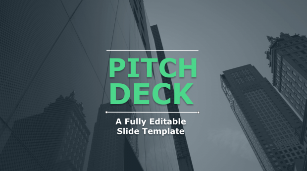
This simple technique works really well for cover slide designs: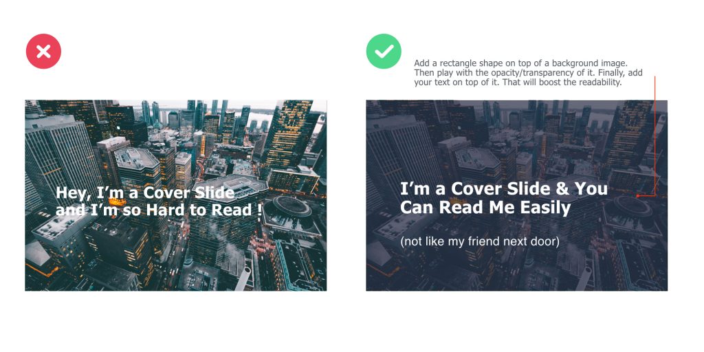
Here’s an example of a pitch deck slide I designed in less than 5 minutes – following this exact process:
Pro Tips 💪
Your presentation title slide should instantly grab the attention of your audience and convey key information about the topic you will cover. Think: can anyone understand what my presentation is about in less than 5 seconds?
Use Repetition Between Text & Visuals to Create Consistency
Repetition is about using similar layouts, arrangements or colors to help create a cohesive look to your presentation. In fact, it’s a simple technique you can use to better break down the content of your slides.
Below, we are using a similar lay-out on the right slide in order to create repetition (image on top, text below, twice):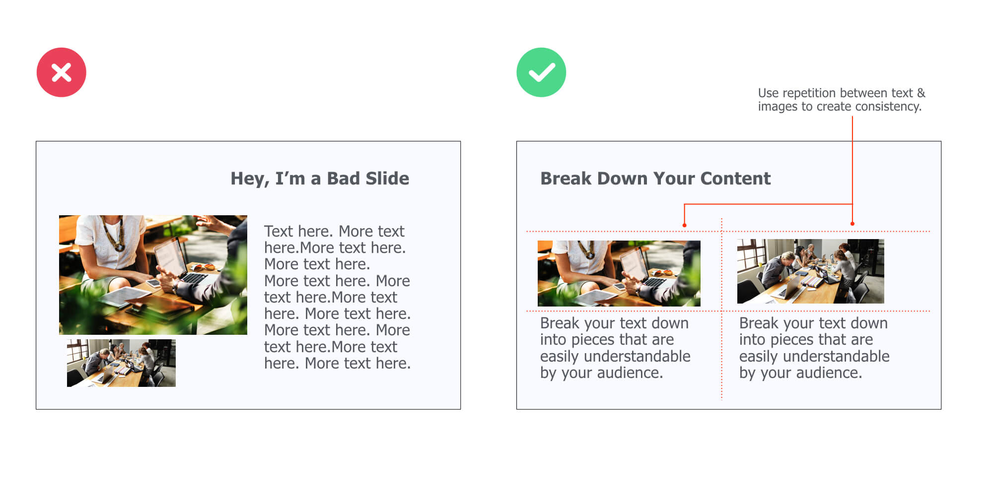
Pick One Visual (Not Twenty)
Instead of putting various of visuals on your slides in order to illustrate a simple point, try to stick to one.
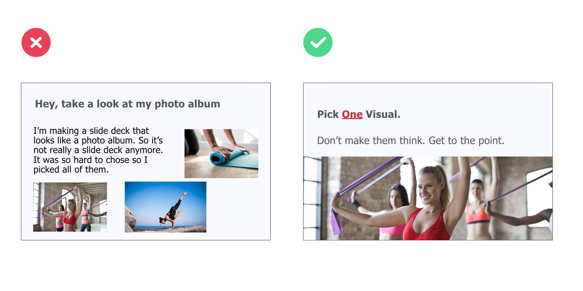
Pro Tips 💪
If you want to integrate various visuals on your slide, then follow the repetition principle highlighted in the previous tip.
Use Plain Backgrounds For Body Slides
Using plain color backgrounds is a simple strategy you can instantly apply to make your body slides look clean and professional: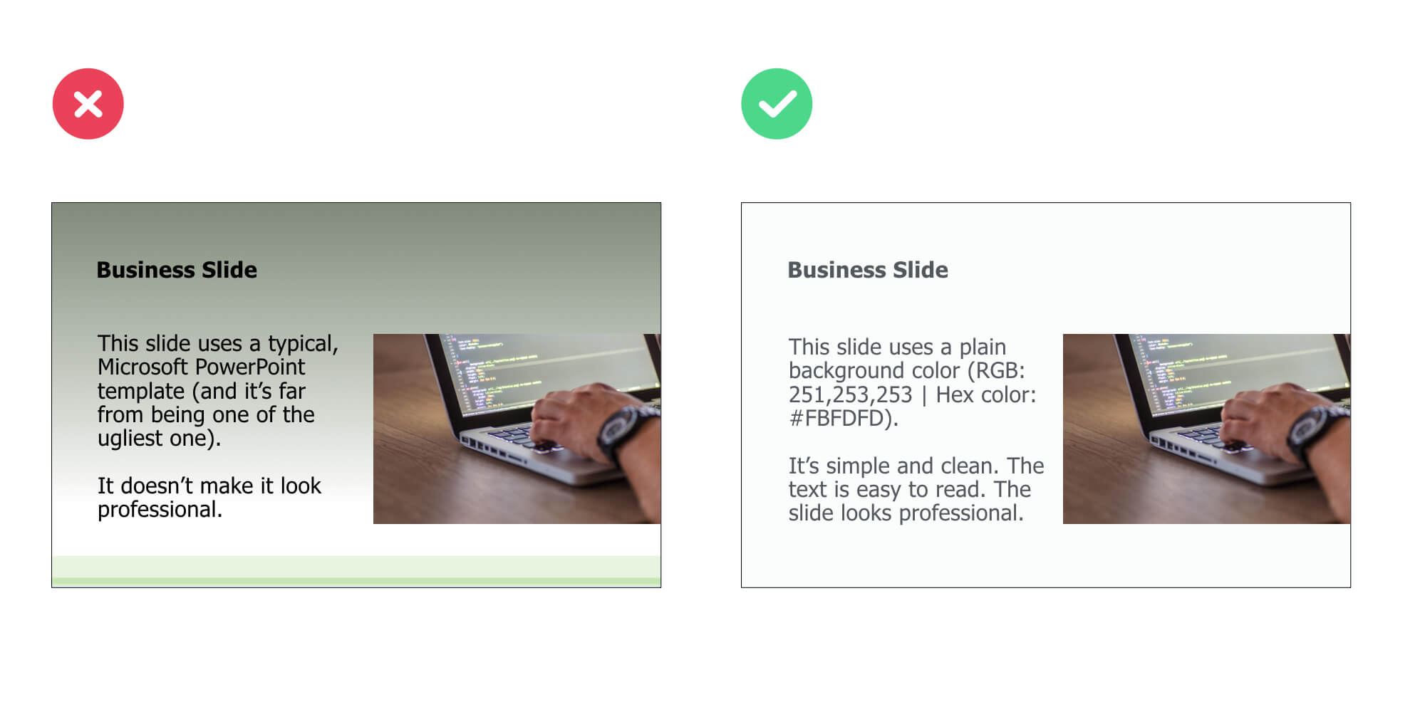
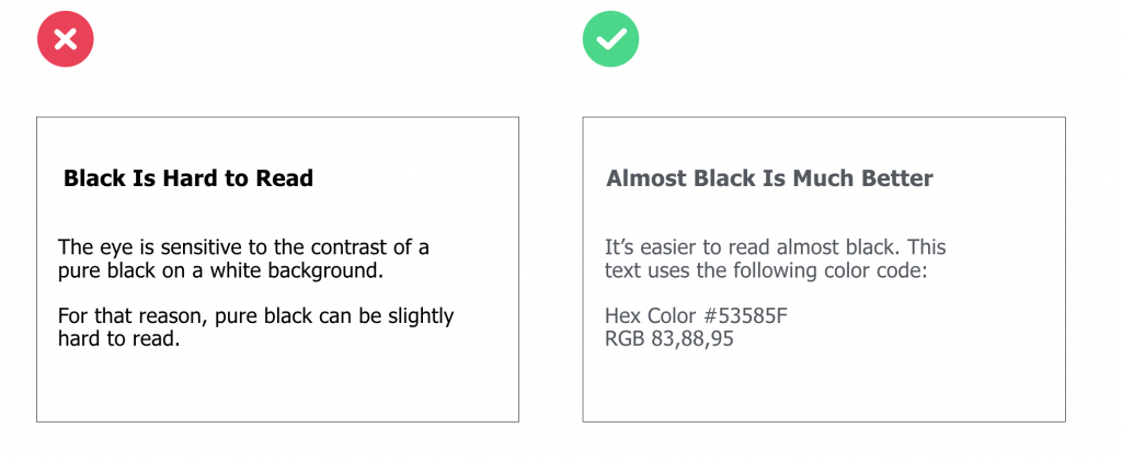
Use Dark Grey Instead of Black
Because it overstimulates the retina, pure black text combined with white background can cause discomfort for the eye when users read the text over an extended period of time.
For that reason, choosing dark grey for the text on a white background will allow the change in brightness not be as drastic. As a result, the visual experience will be more comfortable for your audience:
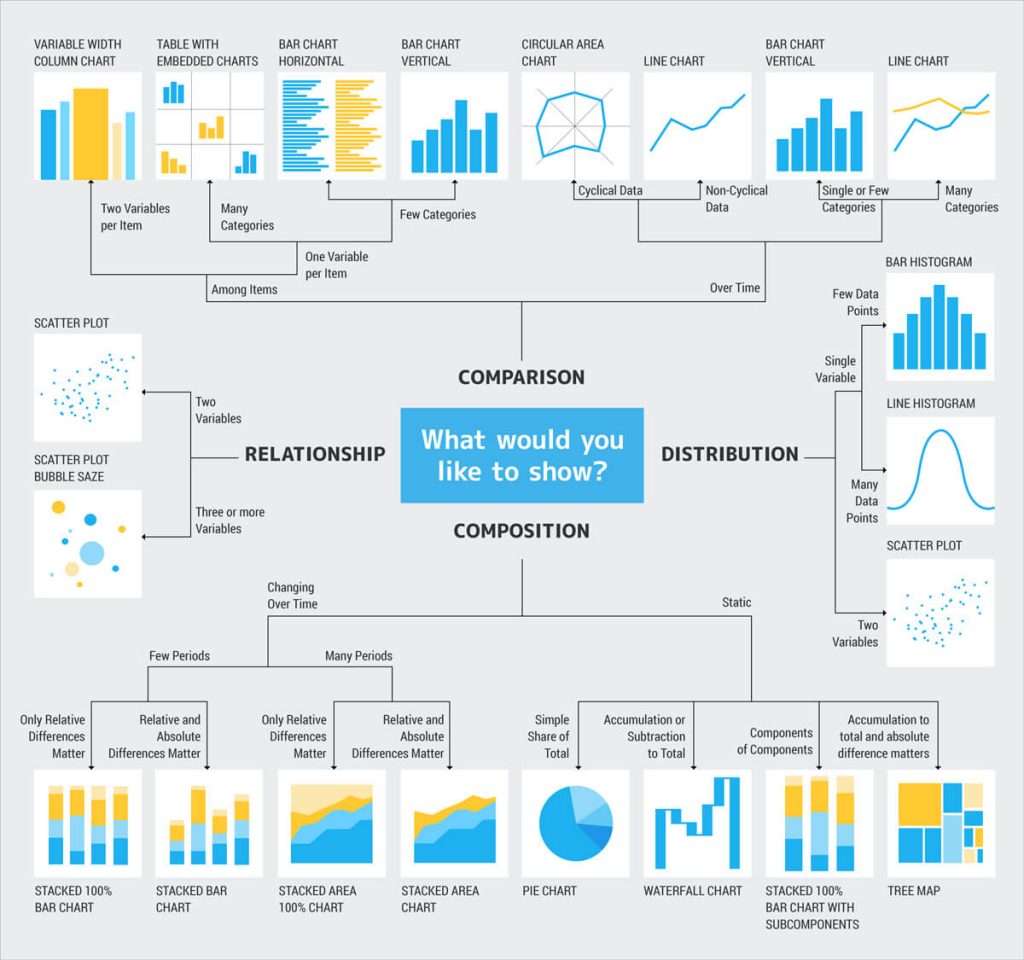
Display Data the Right Way
First, start with defining what you want your audience to know about the data.
Ask yourself:
What type of relationship do I want to emphasize on?
Here’s a great framework you can use to identify which type of chart best fits:
For example, let’s say you want to compare sales volumes in different regions. Which of type of chart do you think would better present the sales across different regions:
A bar chart or a pie chart?
Let’s take a look at a concrete example: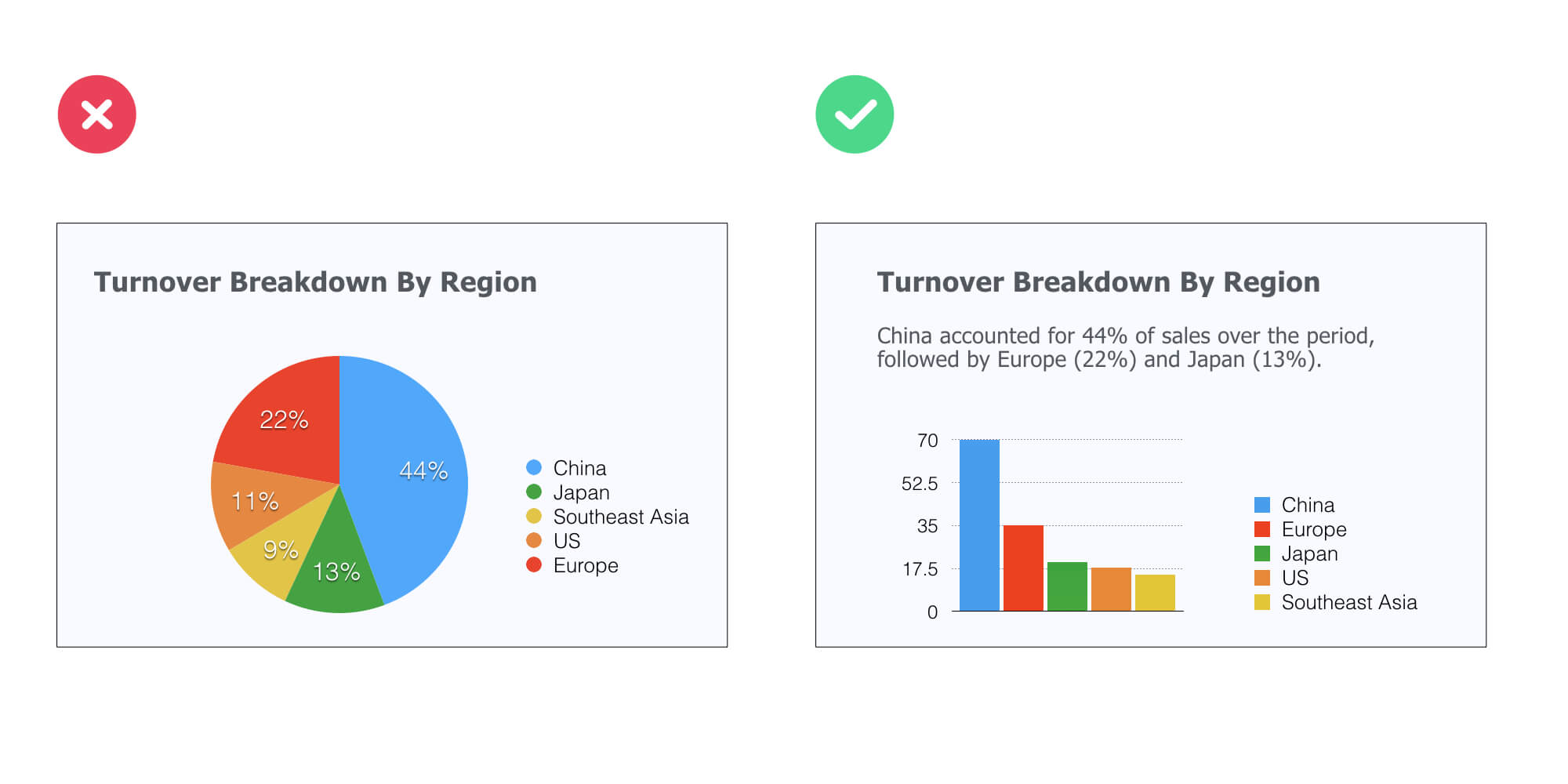 See how it works?
The bar chart instantly points out the top ranking countries, whereas it’s not so obvious with the pie chart. Bottom line: make your information easy to understand and digest for your audience.
Pro Tips 💪
Stick to the the following five principles to present your data in the clearest possible way:
Tell the truth
Get to the point
Pick the right tool for the job
Highlight what’s important
Keep it simple
Increase Space Between Columns For Maximum Clarity
You see, whitespace serve various essential functions, two of which are crucial for mastering slide design effectively:
Improving comprehension (because it makes scanning and reading your content easier and more predictable).
Creating visual hierarchy If you take a look at the example below, you’ll see that using asymmetrical space makes the far left column area stand out against the other columns.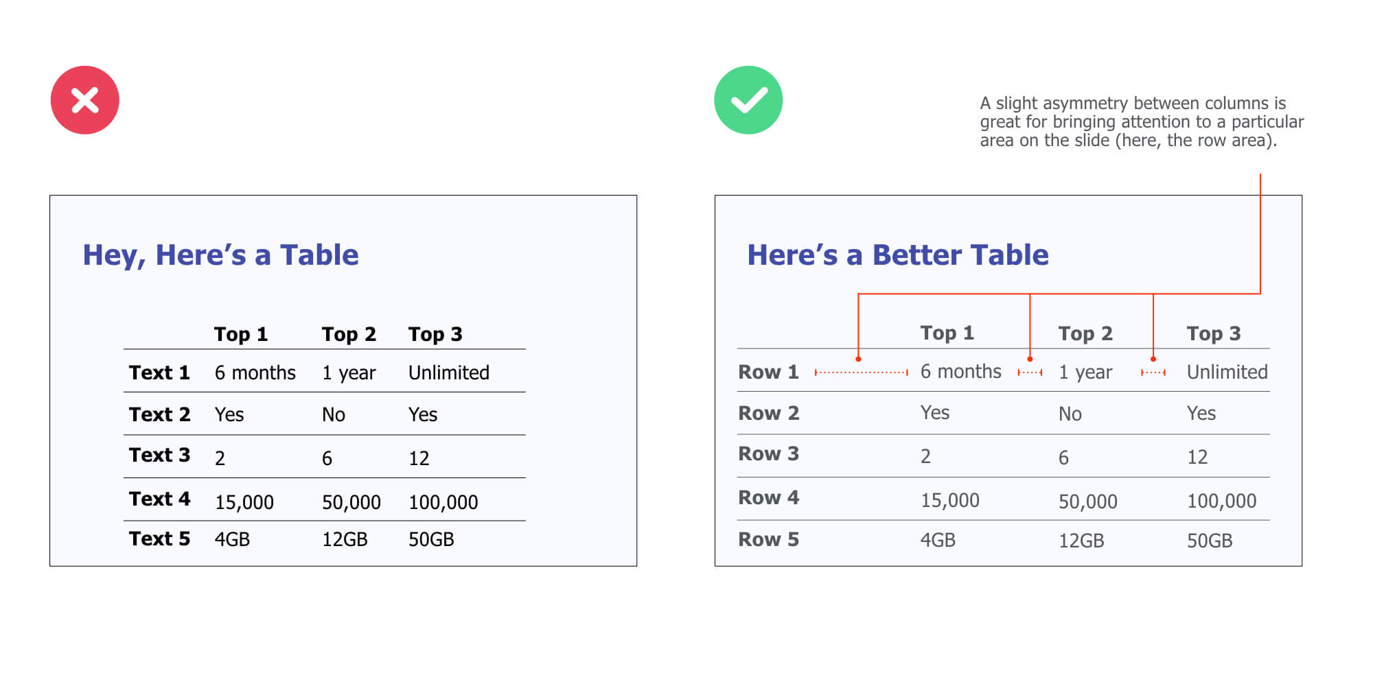 Pro Tips 💪
Remove all visual distractions that are not adding any value to your slides (read: shiny backgrounds, shadows, and other 3d effects).
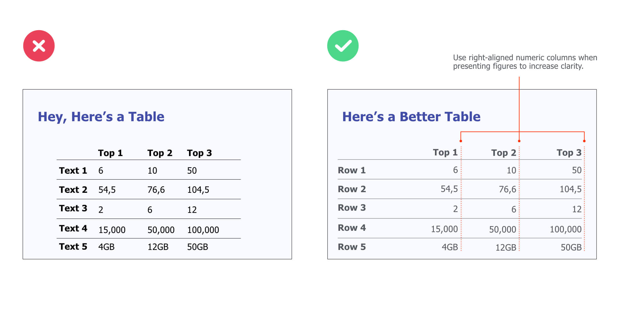
Use This 3-Point Rule to Design Better Tables
It’s not secret that tables can be hard to read (especially when there’s a lot of information). So the question is:
How can you create better tables that are easier for your audience to read?
Here’s a simple, effective rule you can use:
1. Numerical data is right-aligned
2. Textual data is left-aligned
3. Headers (column names) are aligned with their data
PART 3
Creative Presentation Design Ideas & Ideas
In this section, I’ll share some fun ways to quickly improve the designs of your presentations.
Here are some of the things you are going to learn:
👉 Creative techniques to instantly make your slides look good (no matter the type of presentation you’re doing)
👉 How to use emojis or even Youtube to get your creative juices flowing…
👉 And more!

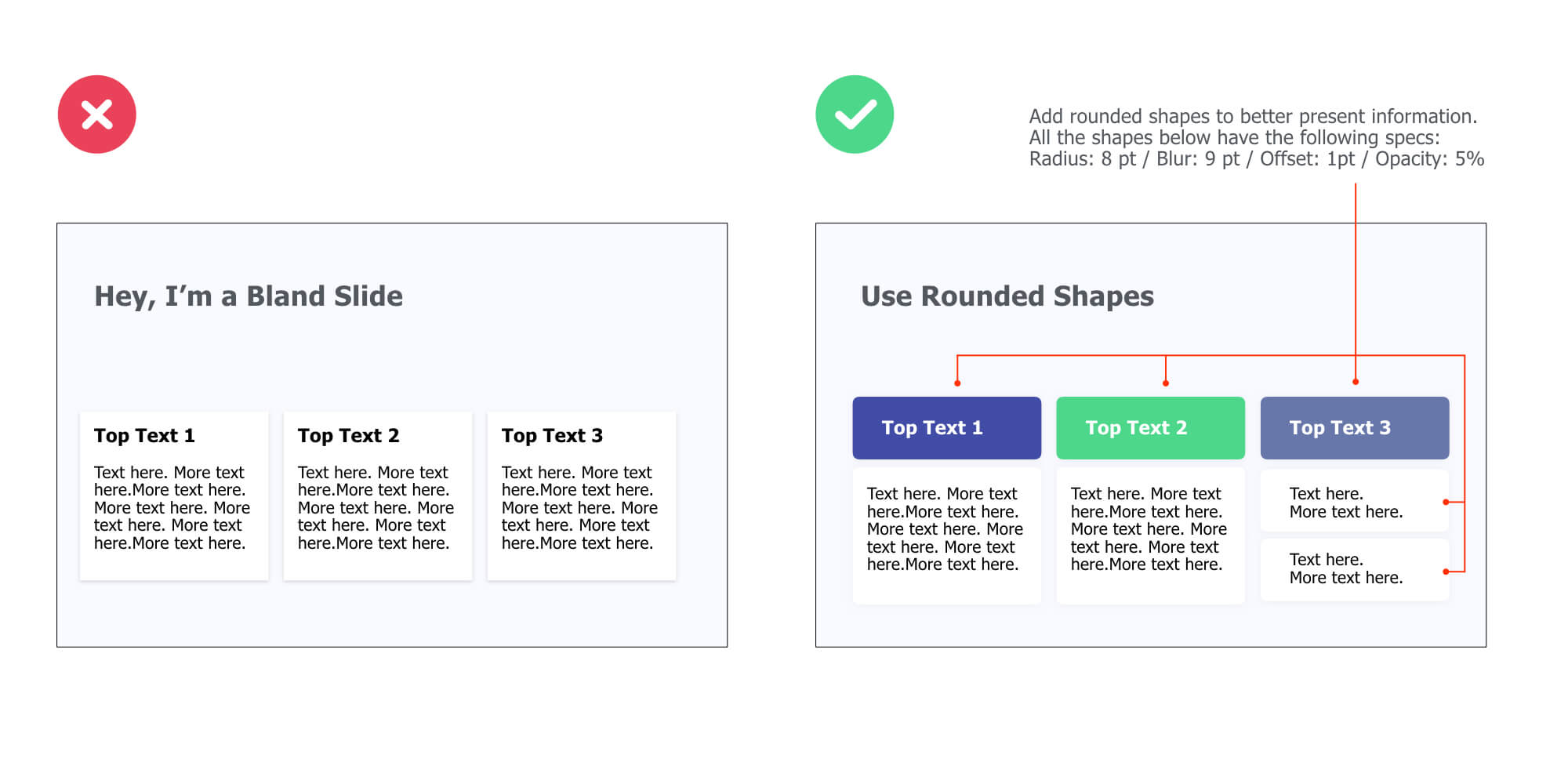
Embed Your Body Text in Rounded Shapes
Here’s a simple, effective hack to present information in a non-boring way:
Embedding your text content in rounded shapes. For instance, as in the example below, I’ve used use colored rounded shapes for headers (e.g. “Top Text 1”) and white ones for content shapes.
You can use this design technique to present company products or services, introduce the core elements of a business strategy, or even present research findings.
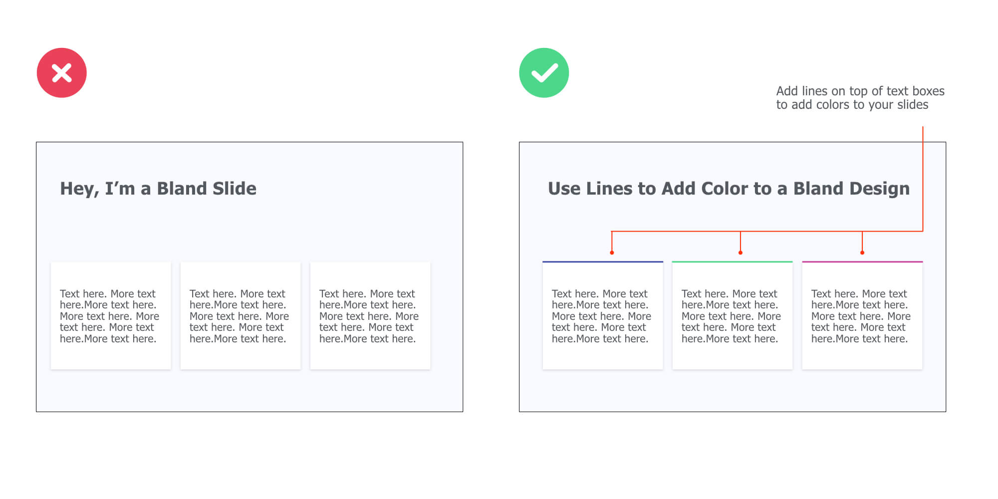
Add Colored Lines to Improve Your Slide Design
Adding a colored line on top of your text box is another simple way to better present information on your slides.
This technique both works with and without text box header (like in the example below) and will instantly make your slide look nicer:
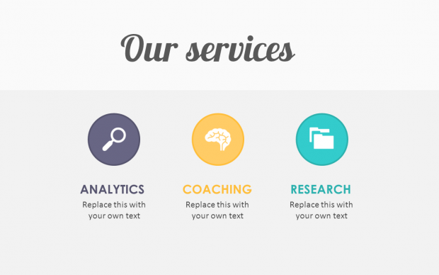
Enclose Icons Inside Colored Shapes to Clearly Convey Information
Embedding icons is a great way to illustrate content, whether you need to present product features or introduce your services in a sales presentation.
For instance:
Now:
While vector images won’t degrade in quality if you increase their size, you sometimes have to deal with small icons. And guess what, small icons are meant to be kept small (otherwise they’ll lack of detail and look pixelated).
So if small icons are all you’ve got, enclosing them inside colored shapes is a great way to go:
![]()
Free Icon Resources 👉
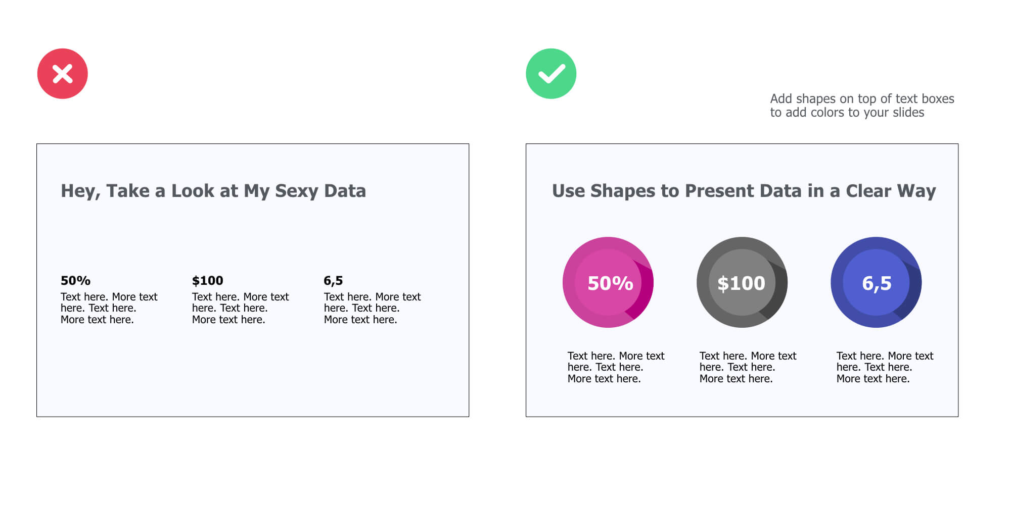
Enclose Data Points Inside Colored Shapes
Here are two great ways to highlight figures in your presentations:
Make them at least 5x bigger
Enclose them in colored shapes (grab the ones I used in the example below right here)
This tip works very well when combined with the Alignment and Repetition principles together:
Use Unique, Fully Editable Illustrations
While standard icons are a great way to present information in a concise and organized manner, they won’t be your first choice if you’re looking to illustrate a message in a more unique way.
So how could you do that you might ask?
Here’s the answer:
Using fully editable illustrations.
Fully editable illustrations are basically visual elements made out of shapes and lines that are stuck together. They’re great for presentations because you can easily recolor and resize them for a truly unique look.
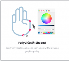
And them plug in your presentation slides to illustrate the content in a unique way:
If you like these illustrations, you can check out the bundle right here.
Here’s an example of a unique illustration I created for the slide below.
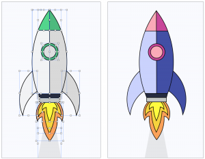
And voila:
![]()
Pro Tips 💪
If you’re looking to get your hands on dozen of beautiful, 100% customizable illustrations for your slides, then check out the Massive X business presentation template bundle. You won’t be disappointed.
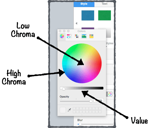
Use the Eyedropper Tool to Match Colors For a More Cohesive Look
The eyedropper is a powerful tool that basically allows you to pick up a color from anywhere on the screen.
A way to use it is to match the color of a visual on the slide to the text on that same slide (Note: it works very well for presentation cover slides).
First, make sure you have the text already put on your slide.
Then, instead of picking a color from the color palette, just grab the eyedropper tool. Here’s how it looks like in both PowerPoint and Keynote:
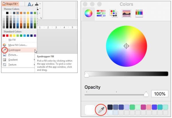
Then, identify a color (pick a bright one if the background is dark, or dark one if the background is bright) you’d like to use for your entire text (or just a part of it):
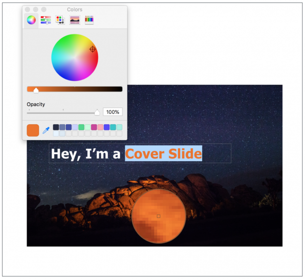
Finally, check out the result:
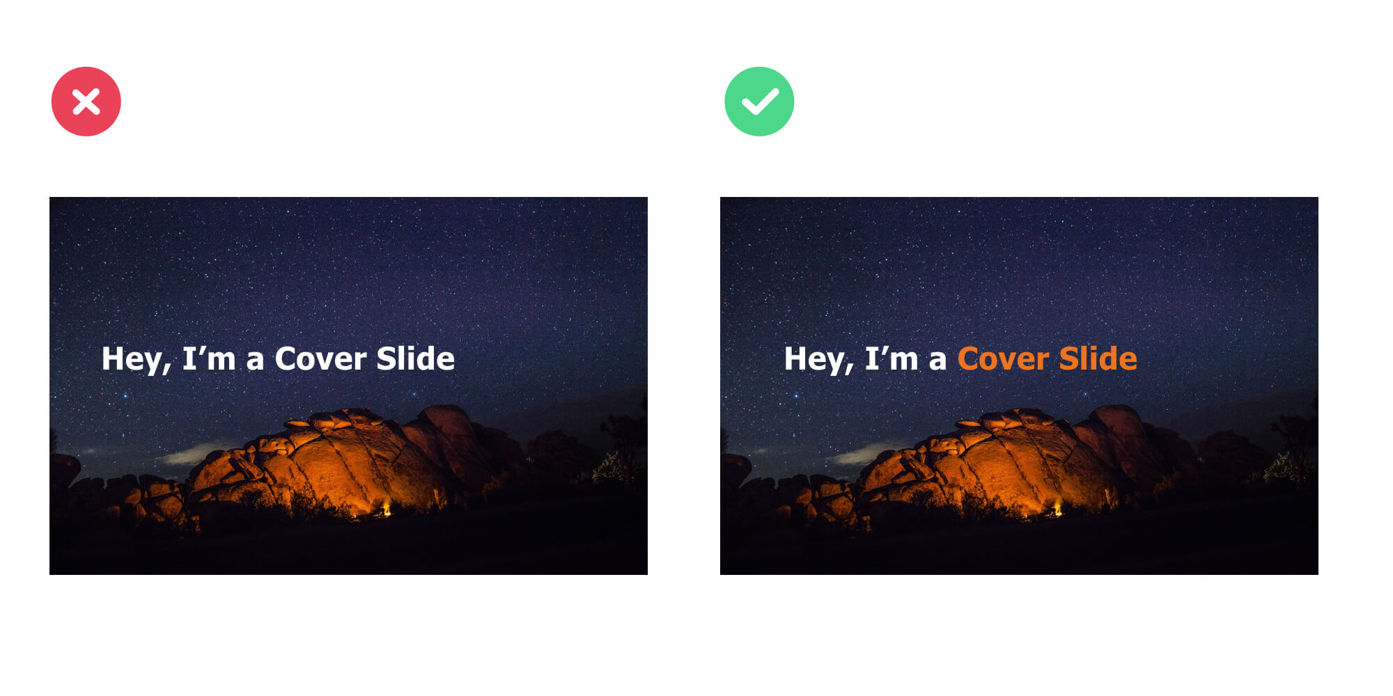
Use Different Font Sizes to Create Hierarchy Between Primary & Secondary Text
Modifying the font sizes is a great way to control the hierarchy within your slides. Plus, it helps your audience to immediately identify the important content from the less important one.
Although you can apply this technique on all types of slides, it works especially well on cover slides.
Here’s an example:
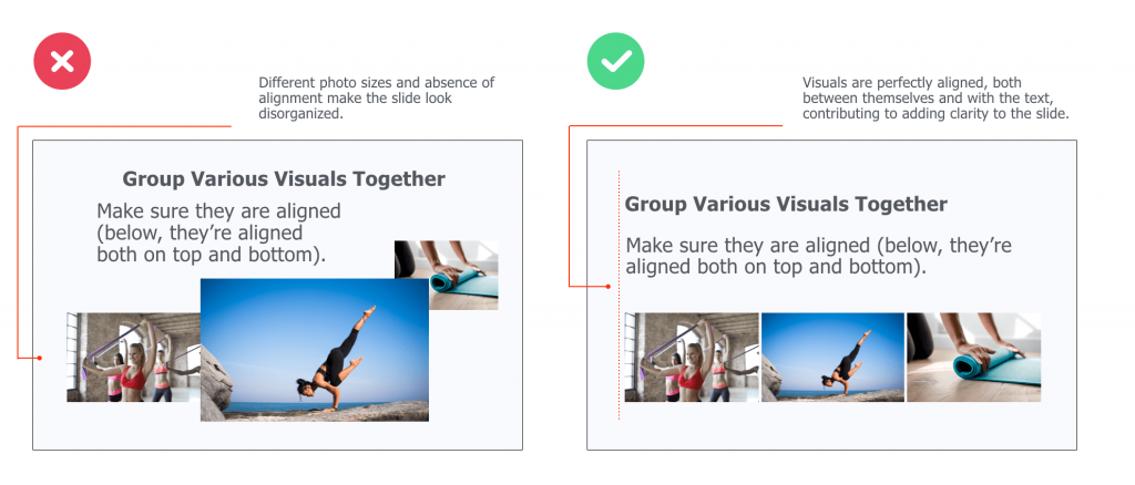
Use One Of These Two Ways to Embed Visuals On Your Slides
The first one is simple:
Instead of putting various of visuals on your slides in order to illustrate a simple point, try to stick to one.
Now, you might want to integrate various visuals on your slide. Luckily, there’s a simple way to do that while still making sure your slide looks coherent:
Group these visuals and making sure they’re aligned, both between each others and with the text that’s in your slide.
Here’s an example of bad and good practices:
Presentation Image Resources 📷
Dig Into Youtube Video Thumbnails
You can use Youtube to find solid presentation design inspiration ideas (Hint: this works very well for cover slides). Here’s how to do it in three simple steps:
- Search for keywords (they can either be related or not to your topic)
- Identify good-looking video thumbnails in the search results
- Use the winning design patterns in your next cover slide
Let’s take a look at an example:
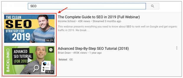
Now…
If you take a look at the second thumbnail, what do you see?
👉 A background visual (green color + headshot)
👉 A description (“Advanced SEO tutorial For 2018”). The text aligned vertically, integrated on top of a black background bold. It’s also bold and all-caps.
Great!
Now, we’re going to use these same patterns to create a cover slide for this article:
And voila!
See, it doesn’t have to be complicated.
Note: Background visual –> found on Pexels (looking for the keyword “design”)
Pro Tips 💪
Another powerful way to get design inspiration for your slides is to head over to Slideshare and use the exact same process.
Reverse-Engineer Beautiful Web Pages’ UX
The point here is to check out website designs you like, identify the common patterns, and create slides inspired from them.
Here’s how to do it:
1. Create a “Swipe file” folder on your computer desktop
2. Add screenshots of web pages you like. It can be homepages, landing pages… Any design that caught your attention
3. When designing your slides, pick a screenshot you like, identify the most common patterns and copy them
Let’s take a look at the example below:
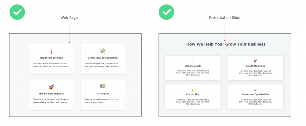
The left visual is a screenshot of a career page where the company highlights the peeks they offer.
The right visual is a slide that presents services a digital company offers to potential clients.
In this example, we have used…
👉 The same lay-out (4 boxes)
👉Similar colors and shade effects (white, slightly blurry box borders)
👉The emojis to illustrate the content of the boxes
Embed Emojis
Integrating emojis is an effective (and creative) way to convey feelings while bringing freshness to your presentation designs.
For example, you can use them to introduce paragraphs in your body slides:
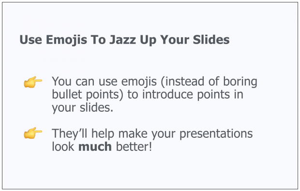
Or to illustrate cover slides:

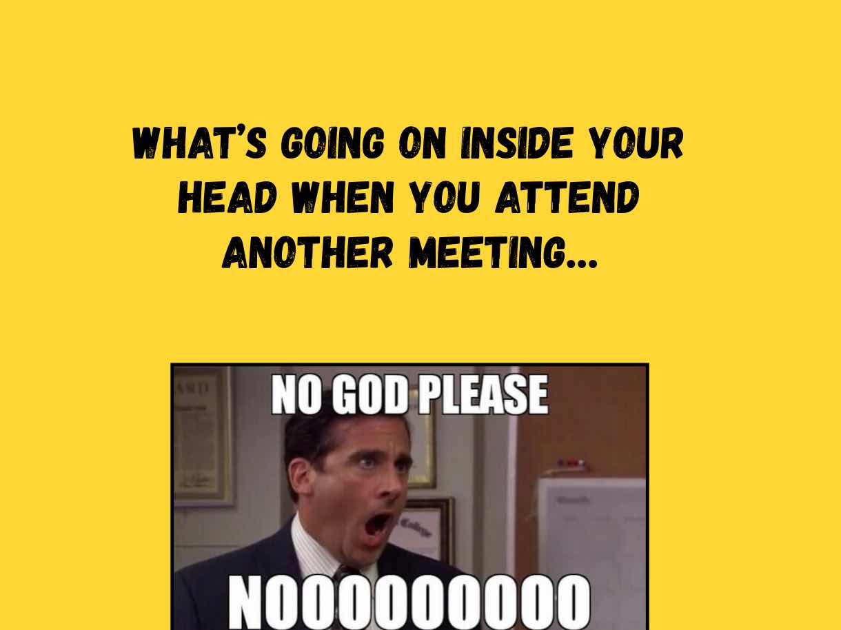
Use Memes
You can also integrate memes in your slides. Here’s an example:
Pro Tips 💪
When searching for emojis on Google images, make sure to add + “transparent” or “PNG” to your search query. For example: “emoji hand transparent” will help you find emojis that have transparent backgrounds (which makes easier for you to integrate in non-white background slides).
Meme Generator is a cool site that’ll help you create your own memes.
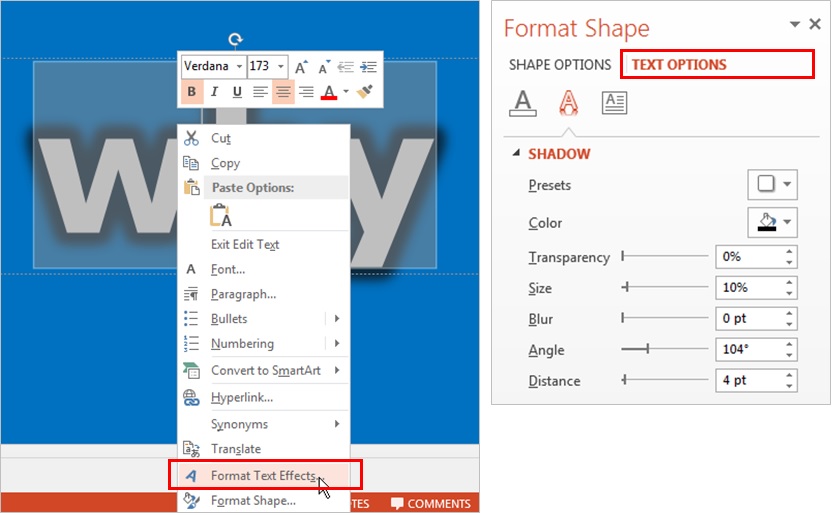
Integrate Shadow Effects On Text & Visuals
Shadow effects are subtle, tiny hacks that can allow any design to go from good to great.
Here’s a shadow effect example on a visual:

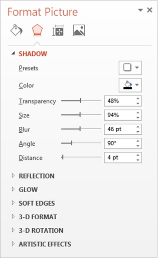 Pro Tips 💪
Make sure you either chose a visual that already has a transparent background. Or make an image background transparent with PowerPoint or Keynote.
Now, you can also add shadow effects to your text:

Once you’ve typed your text, select the portion of the text you want to add effect on, click right, and select “format text effects”. Then tweak the shadow options until you get something you like.
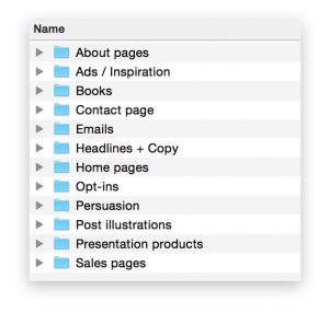
Create Your Own “Swipe File”
Create a folder on your desktop and title it “Swipe File”.
Anytime you see a beautiful slide design, just add it to your swipe file.
Set up individual folders or labels to organize your findings well and save time (E.g. “Great Cover Slides”, “Business Slides”, etc). Pretty soon, you’ll have a huge bucket of inspiration that you can tap into when working on your own presentations.
Here’s how my own swipe file looks like:
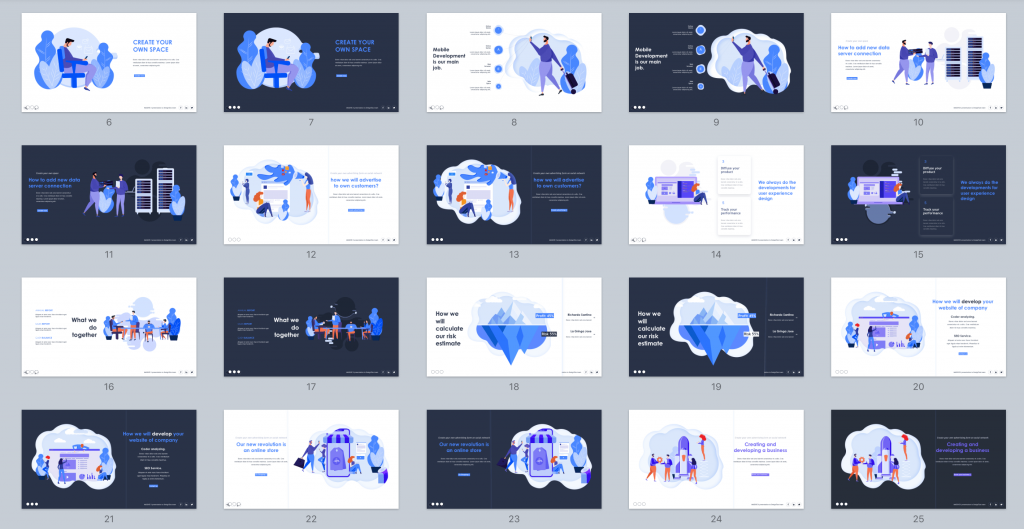
Invest In Presentation Templates
Ready-to-use templates help you create great presentations fast (and at the fraction of what a designer would cost you).
Most templates include everything you need, from gorgeous, easy-to-edit slides and icons to charts and ready-made color themes. In this article, I am reviewing my favorite designer-made PowerPoint and Keynote bundles that’ll help you clearly and concisely present information.
Plus, many business templates include fully editable graphics you can use to illustrate your slides in a professional manner.
For instance, I’ve used the graphics of Massive X, one of my favorite templates, to illustrate the chapters of this presentation guide.

Are You Spending a Lot of Time to Make Presentations? 🤓
What if you could design beautiful presentations FAST (and what if you could ALSO get beautiful, editable illustrations on top of it)?
For less than the price of a movie ticket, you could get immediate access to hundred of designer-made, beautiful slides at a fraction of what a designer would charge you (for just an hour of work).
If you want to make presentations that people will remember, then you should consider getting pre-built, fully editable templates….
See, top performers know that presentations can have a huge impact on their business. Because the truth is, when you start deliver top-tier business materials, you’re able to:
- Present clean slides that grab – and keep – people’s attention
- Confidently expressing ideas, concepts and messages with visual elements.
- Wow your prospects, get them to walk away knowing you’re the pros and eliminating other options.
Introducing Pre-Built Presentation Templates

With pre-built templates, you get your hands on a massive stash of editable resources – slides, vector icons, graphics, timelines, maps and so on – to build result-getting presentations. At a fraction of the time it takes to others.
If you’ve been looking to create quality presentations faster, then check out one of my favorite templates below, and start saving time so you can focus on things that really matter to you.
Massive X Template
With countless design options, practical slides and a recent bundle update, Massive X toke the business of presentation templates to a whole new level of professionalism and creativity.
Maybe you’d like to check out their intro video:
Now, what I love about this bundle is their 100% editable illustrations:

Just like the PowerPoint icons I’ve given away in this article, Massive X’s illustrations are made out of multiple, individual elements that are then put together.
And you can edit the color, size and shape of every single one.

And the great news is, Massive X comes with a ton of editable illustrations you can use for multiple purposes:
Now, let’s take a look into the details of the bundle…
Key Features
- 290 unique PowerPoint slides
- Animated slides
- 12,000 icons
- 15 color variations
Not sure about what templates can do for you?
No worries, maybe you’d like to see my detailed review of the best presentation templates available on the market below.
👉 Affiliate disclosure. PPTPOP is a participant in the Envato Affiliate Program, and we get a commission on purchases made through our links (it doesn’t cost you anything).